Happiness Is a Normal Yield Curve
-
 John Mauldin
- |
- July 29, 2017
- |
- Comments
- |
- View PDF
Troublesome Facts
Yield Curve 101
Short-End Manipulation
QT Is Coming
Peak Complacency
Grand Lake Stream, Maine; Beaver Creek, Colorado; and Lisbon, Portugal
“I never liked quantitative easing. Flattening the yield curve is not stimulative; flattening the yield curve is anti-stimulative.”
– Ken Fisher
“There is a limit to how much the United States Treasury can borrow.”
– Alan Greenspan
“In other words, we have the models we have because of inertia and theology, but also because all we can do is all we can do.”
– Kit Webster
“[T]he specific manner by which prices collapsed is not the most important problem: A crash occurs because the market has entered an unstable phase, and any small disturbance or process may have triggered the instability. Think of a ruler held up vertically on your finger: This very unstable position will lead eventually to its collapse, as a result of a small (or an absence of adequate) motion of your hand or due to any tiny whiff of air. The collapse is fundamentally due to the unstable position; the instantaneous cause of the collapse is secondary.”
– Didier Sornette, French geophysicist

Photo: Paul Kelly via Flickr
Once again I start this letter with a warning: A recession is eventually coming and a financial crisis with it. There is a real potential for it to come soon, as in the next year or two, although serious tax reform could change that equation. But at the end of the day, the pressures of too much government debt and too many government promises, plus growth that is continually grinding slower, will result in a recession. There is always another recession. You can’t run your life and business as if you expect one to happen tomorrow, but you can make contingency plans. With each passing day, recession gets closer, but that’s no reason to be fearful if you’re prepared.
I’m not trying to sound like an Old Testament prophet – OK, so maybe I am – but this is serious. Many business owners aren’t ready, nor are many portfolio managers and individual investors. They will likely regret their inattention.
Today I will show you a simple indicator that has an excellent recession-forecasting record, according to research by the Federal Reserve itself. Though the Fed’s own wacky policies may have weakened this early-warning system’s reliability, an interpretive adjustment can restore its usefulness.
First, thought, let me give you yet more reasons for concern on a completely different front. We have been getting complaints from readers that Thoughts from the Frontline is no longer showing up in their inboxes. We have cornered the problem, and its name is Google.
Google’s Gmail creates categories to characterize emails that are sent to your inbox. They are trying to route all newsletters directly into a dedicated folder (I believe they even call it “Promotions”), instead of sending them through to people’s inboxes. There is not much we can do about it at this point. I’m on the hunt for an email delivery specialist who can help us with what is now being called “inboxing.” This problem is industrywide. If you are using Gmail, you might want to check to see where the emails that you want to read are actually being routed.
The industrious Michael Lebowitz of 720Global performed an invaluable service last week by assembling “22 Troublesome Facts” behind his reluctance to follow the bullish herd. Most have helpful source links, too. Here’s a small sampling:
• The S&P 500 cyclically adjusted price-to-earnings (CAPE) valuation has only been higher on one occasion, in the late 1990s. It is currently on par with levels preceding the Great Depression.
• Total domestic corporate profits (w/o IVA/CCAdj) have grown at an annualized rate of just .097% over the last five years. Prior to this period and since 2000, five-year annualized profit growth was 7.95%. (Note: Period included two recessions.)
• Over the last 10 years, S&P 500 corporations have returned more money to shareholders via share buybacks and dividends than they have earned.
• At $8.6 trillion, corporate debt levels are 30% higher today than at their prior peak in September 2008.
• At 45.3%, the ratio of corporate debt to GDP is at historical highs, having recently surpassed levels preceding the last two recessions.
So, US corporations are simultaneously more indebted, less profitable, and more highly valued than they have been in a long time. Furthermore, they are intentionally making themselves more leveraged by distributing cash as dividends and buying back shares instead of saving or investing that cash. Yet investors cannot buy their shares fast enough. Maybe this will end well… but it’s hard to imagine how.
The once-foolproof recession indicator I mentioned up top is the Treasury yield curve. It has allowed me to predict the last two recessions. The yield curve is simply a chart showing Treasury yields on the vertical axis and maturity on the horizontal axis. Below is how it looked at mid-year 2017, courtesy of the US Treasury’s website. You can plot other dates here.
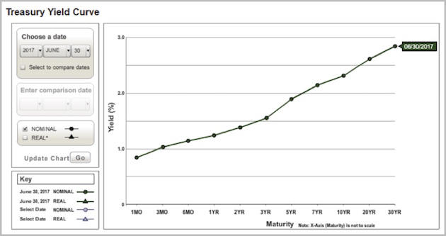
Bond traders keep a close eye on the yield curve, and especially on changes in its shape. The curve above is fairly normal. Other things being equal, you expect interest rates to slope upward as time to maturity increases. That’s because lenders demand higher rates to compensate for the higher risk that comes with lending money for longer periods. The longer you let a borrower hold your cash, the greater the chance something bad will happen to it.
The yield curve’s angle is important, too. It gets steeper when lenders perceive greater risks to long-term loans because, for example, they expect inflation to rise. It’s flatter if inflation risk seems low.
Now, compare the one above with the yield curve of Nov. 30, 2006.
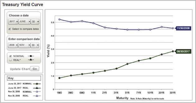
Note that yields across the whole curve were higher than they are now. More importantly, the curve is inverted, meaning the short end is actually higher than the long end. At that point investors demanded higher yields for 1-month loans than they did for 30-year loans.
The inverted yield curve historically shows up only when the economy is in recession or soon will be. An inverted yield curve doesn’t cause a recession but does indicate unusual stress in the market. Lenders presume the Fed will reduce rates soon, so demand increases for longer-term bonds whose rates are locked in. High demand pushes their prices higher and yields lower. The opposite happens at the short end, so those rates rise, and the curve flattens or inverts.
Like what you're reading?
Get this free newsletter in your inbox every Saturday! Read our privacy policy here.
The inverted yield curve is a classic recession indicator. It inverted in early 2000, right after the Y2K scare proved unfounded and the dot-com bubble was starting to burst. It inverted again in 2006–2007.
A 1996 New York Federal Reserve Bank study looked at the spread between 90-day and 10-year Treasury yields and found that an inversion preceded every recession of the modern era. That Fed study built on earlier research by economist Campbell Harvey, who is now at Duke University. Not every inversion signaled a recession, though. The study actually goes into the probability of a recession depending on the depth of the inversion and the length of time the yield curve is inverted. Typically, by the time a recession starts, the yield curve has a normal slope. Also typically, an inverted yield curve of the proper depth and duration suggests that a recession is due in about 12 months. I find the research fascinating, and you can read more about it in my December 30, 2005 letter.
The same authors also did an analysis of 20 different leading indicators. The only indicator that had any true reliability in predicting recessions was the inverted yield curve. While other measures and signals may be useful, they either provided false predictions or failed to recognize a coming recession.
Now, since the yield curve is not presently inverted, why am I worried? Because it no longer tells us what it once did.
Look again at the June 30 yield curve. Now, let’s roll forward to July 20. Direct your attention to the red arrow, where we see a slight inversion forming.
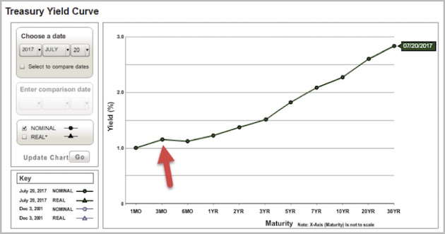
On that day, the 3-month Treasury yield exceeded the 6-month yield. It still does today. Why would that be? Well, yields rise (and prices fall) when supply exceeds demand. So fewer people seem to want those 3-month bills.
When is three months from July? That would be October, when there is a fair chance that the US will be embroiled in another debt-ceiling/government-shutdown scenario. T-bills maturing in that period face a slight risk of delayed payment. The odds are low but still enough to show up in T-bill yields.
Joe Wiesenthal at Bloomberg illustrated it another way in the chart below. During the 2013 debt standoff there was a spike down in the 6-month/1-month Treasury spread. Now we see the same in the 6-month/3-month spread.
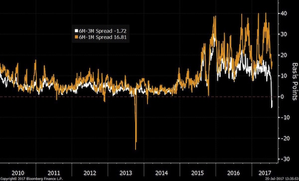
Keep in mind that US Treasury bills are probably the most liquid fixed-income instruments on the planet. Few markets are more efficient than this one. Generating this kind of outlier spread isn’t easy, but our crazy political situation is doing it. Peter Boockvar considers this inversion as noise that will pass when (we hope) Congress raises the debt ceiling and repayment risk again drops to zero.
More interesting, Peter believes that years of artificially capped short-term rates have changed how the yield curve works. He thinks the short end tells us little about economic prospects. He watches the spread between 5-year and 30-year Treasury yields. It has dropped considerably in the last year but is still a long way from inverting.
That’s small comfort. It probably means recession isn’t right around the corner, but it is likely still coming, and this week’s FOMC statement indicated they still plan to tighten policy, even as growth remains stalled. We will likely see fed funds hikes in September and/or December. The FOMC also said that the balance sheet reduction plan will commence “relatively soon.” I think that probably means September, but we’ll see.
By the way, let me publicly thank Peter Boockvar for giving us a new buzzword. The Fed called its bond-buying program, from which it is now trying to exit, “quantitative easing” or, in today’s GDP numbers release, “QE.” Those simple initials have saved me and other writers untold millions of keystrokes. But what do we call the ending of QE? The FOMC statement refers to it as “balance sheet normalization.” That’s too long.
Peter says this is very simple. The opposite of easing is tightening, so the opposite of QE is QT: quantitative tightening. He likes this shorthand also because it stresses what the Fed wishes to disguise: Reducing its balance sheet really is tightening. QT will remove stimulus and make borrowing more expensive and difficult. So spread the word: QT is coming.
I can understand why the FOMC feels the need to normalize rates before handing the baton, no later than the middle of next year, to what will essentially be the Trump Federal Reserve Board. But I am totally mystified as to why its members feel the need to reduce the Fed’s balance sheet at the same time. Percentagewise, the Federal Reserve increased its balance sheet dramatically in the 1930s. Then they left it there. Eventually the balance sheet became relatively small again as the economy grew.
Like what you're reading?
Get this free newsletter in your inbox every Saturday! Read our privacy policy here.
I see no reason to hit the market with a double whammy when simply raising rates at the short end will be adjustment enough. If for some reason inflation rears its head, the Fed can fire up QT. In today’s GDP numbers release, however, the Fed’s favorite measure of inflation was a mere 1%. Annualized second-quarter GDP growth was estimated to be 2.6% after adjusting for inflation. Nominal annualized GDP growth was 3.6% when 4% was expected. I scratch my head wondering why the Fed feels driven to fight inflation that is not showing up in the data.
As Lacy Hunt said in this week’s Outside the Box, there is a slavish regard at the Fed for the Phillips curve, the theoretical link between wages and employment. The theory says that with unemployment levels as low as they are, we should be seeing more inflation, so the Fed wants to make sure they keep ahead of the curve. However, both the way they measure inflation and the way they measure employment have significant problems and errors. When so many people who out of work are not officially listed as unemployed (and thankfully last month we saw some of them actually begin to come back to the workplace), the headline unemployment number is highly suspect, if not downright misleading.
We are clearly late in the business cycle, and the Fed is asking for trouble with its tightening policy. It risks making a monetary policy error – one of the major causes of recessions.
My friend Kit Webster and I were talking recently about the futility of using mathematical models to predict the future of an economy so complex as to defy modeling. Fed economists interpret flawed models like the discredited Phillips curve (which both Volcker and Greenspan panned) with a faith tantamount to religion, like modern-day shamans and witch doctors mulling sheep entrails. Just as economists believe models that repeatedly fail to make accurate predictions, many of us in turn choose to believe our high-priest Fed economists. After all, we want to believe that somebody knows what’s going to happen.
Back to the yield curve and its ability to predict a recession. The Federal Reserve’s tampering at the short end of the yield curve has rendered this traditional predictive device useless. We have to adapt. With that in mind, it’s important to note that the 5-year/30-year yield spread has been tightening coincidentally with a slowdown in GDP growth from already low levels. There is the potential for a move from where the curve is now to inversion within a year. Attention must be paid. An outright recession would likely follow, but we’ll feel a downdraft whether the data fits the formal criteria or not.
It’s tough to state that there will be another recession without having the tools to really give a firm prediction. We just don’t have enough good research; so we must be more vigilant, especially in this time of stretched valuations and market sensitivity.
The good news: The yield curve can still be our early-warning indicator, with the proviso that we ignore the short maturities and watch the 5-year/30-year spread or maybe even the 5-year/20-year. You can monitor this yourself by checking T-bond yields on most financial news sites. Find the 30-year yield (or 20) and subtract the 5-yield from it. Right now, the difference is around 1.1 percentage points. The lower it goes, the closer recession may be.
My Swiss friend Alexander M. Ineichen of Ineichen Research & Management AG conducts a massive amount of research each month on momentum in markets all over the world. He recently analyzed how momentum models looked like prior to the last two recessions, before and after the peaks. Then he compared what he found to our situation today. His work is too lengthy and chart-rich to reproduce here, but I can give you a link to it and share at least one chart and his take on what I call “peak complacency.” You can see the latest report, titled “Peaks,” in his sample materials here. Quoting:
Risk: Most risk gauges imply, if anything, investor complacency. VIX, for example, has been single digit a couple of times over the past months, a rarity. It was single digit at the Nasdaq peaks since mid-July. VIX was at a new all time low at 9.04 when finishing this document on 25th July. Figure 19 shows one way of measuring investor complacency. Chart shows trailing P/E ratio of S&P 500 divided by VIX, i.e., implied volatility. The higher the ratio, the more complacent is investor sentiment. Currently, there is no fear.
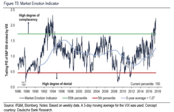
Risk happens fast. It happens even faster in a complacent market. Pay attention…
Grand Lake Stream, Maine; Beaver Creek, Colorado; and Lisbon, Portugal
As I write, I find myself in yet another hotel room, getting ready for meetings. Shane and I will enjoy a getaway this weekend before we travel back to Dallas and I get ready to go to the annual economics fishing trip (informally called Camp Kotok after David Kotok of Cumberland Advisors, who organizes the event). It is one of the highlights of my year. I get to see lots of friends and talk economics and meet interesting new people. I try not to let the fishing get in the way of having a good time.
At the end of the month Shane and I will head to Beaver Creek, Colorado, for a few days in the cool mountains, readying for a busy fall. Later in September I will head to Lisbon after speaking in Wisconsin the day before I fly. Otherwise, I’m trying to stay home as much as possible so that I can work on my writing and research, but this week I spent two full days simply working through my monstrous email backlog. It is amazing how fast emails can pile up in my inbox.
Next week will mark the beginning of the 18th year that I’ve been writing Thoughts from the Frontline. All my good calls and great calls and all my bad and truly annoying calls are archived for everyone to see. I admit it’s tempting to delete a few of those letters from the archive, but that would not preserve the level of authenticity that I want to keep. I’ll write more about that anniversary next week, but for now let me thank you for being with me. As one friend and reader said to me a few days ago, “Yea, though I walk through the Valley of the Shadow of Death, I will fear no central banker, because John is there beside me.”
It’s time to hit the send button. You have a great week, and I’ll be writing to you next week from Maine.
Your glad we’re all in this together analyst,

John Mauldin
P.S. If you like my letters, you'll love reading Over My Shoulder with serious economic analysis from my global network, at a surprisingly affordable price. Click here to learn more.
Put Mauldin Economics to work in your portfolio. Your financial journey is unique, and so are your needs. That's why we suggest the following options to suit your preferences:
-
John’s curated thoughts: John Mauldin and editor Patrick Watson share the best research notes and reports of the week, along with a summary of key takeaways. In a world awash with information, John and Patrick help you find the most important insights of the week, from our network of economists and analysts. Read by over 7,500 members. See the full details here.
-
Income investing: Grow your income portfolio with our dividend investing research service, Yield Shark. Dividend analyst Kelly Green guides readers to income investments with clear suggestions and a portfolio of steady dividend payers. Click here to learn more about Yield Shark.
-
Invest in longevity: Transformative Age delivers proven ways to extend your healthy lifespan, and helps you invest in the world’s most cutting-edge health and biotech companies. See more here.
-
Macro investing: Our flagship investment research service is led by Mauldin Economics partner Ed D’Agostino. His thematic approach to investing gives you a portfolio that will benefit from the economy’s most exciting trends—before they are well known. Go here to learn more about Macro Advantage.
Tags
Did someone forward this article to you?
Click here to get Thoughts from the Frontline in your inbox every Saturday.

 John Mauldin
