Recession Rumbles
-
 John Mauldin
- |
- July 19, 2019
- |
- Comments
- |
- View PDF
I’m often asked if recession is coming, and for quite different reasons. Some people worry about their investments. Others are worried about their employment or their kids. Political types wonder if and how recession could affect the next election.
To all those people, for quite some time now, my answer has been: “Yes, but not just yet.” That’s still what I think today, but more of the early warning signals I have used in the past are beginning to flash again.
Looking at the data, I see some good news but also some leading indicators weakening. I see smart people like Dave Rosenberg argue we may already be in recession today. And I see Wall Street not really caring either way, so long as it gets enough rate cuts to prop up asset prices. None of that is comforting.
Today we’ll look around and see what is happening. Because I try to be aware of my own biases, we’ll consider some more optimistic views, too. They may not be convincing, but it’s important to confront them.
As you’ll see, the storm clouds are gathering. Someone is likely to get hit. It might be you.
Longer and Weaker
Let’s begin by reviewing where we are. I think we all agree this recovery cycle has been both longer and weaker than in the past. Any growth is good, of course, and certainly better than the alternative. But the last decade wasn’t a “boom” except in stock and real estate prices.
(Quickly, let’s put to rest the myth that the longer a recovery goes, the greater the likelihood of a recession. That’s a tautology. Recoveries don’t stop because of length. Back to the main point…)
I like this Lance Roberts chart because it shows long-term (5-year) rates of change, over a long period (since 1973) in three key indicators: Productivity, wage growth, and GDP growth. You can see all three are now tepid at best compared to their historical averages.
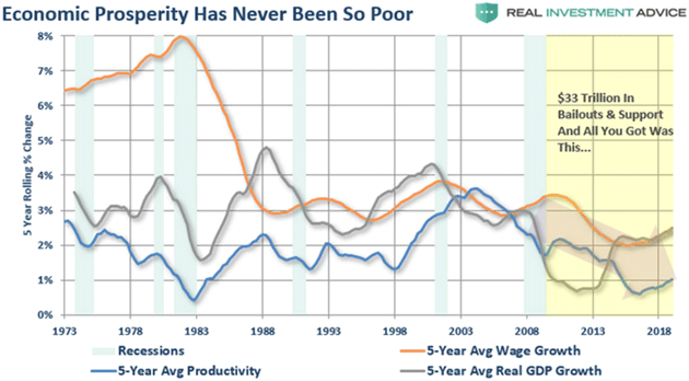
Source: Lance Roberts
These measures have been generally declining since the early 2000s, suggesting that whatever caused our current problems preceded the financial crisis. But we don’t need to know the cause in order to see the effects which, while not catastrophic (at least yet), are worrisome. And, as Lance points out, a decade of bailouts and dovish monetary policy didn’t revive previous trends.
The growth deceleration is also visible if we zoom into the recent past, via the Goldman Sachs Current Activity Indicator. It peaked in early 2018 (not coincidentally, at least in my opinion, about the time Trump started imposing tariffs on China) and slid further this year. Much of it is due to a manufacturing slowdown, but the consumer and housing segments contributed as well.
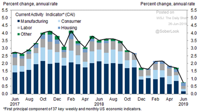
Source: Goldman Sachs via The Daily Shot
Again, this doesn’t say recession is imminent. The US economy is still growing by most measures. But the growth is slowing and, unless something restores it, will eventually become a contraction.
My friend Lakshman Achuthan of the Economic Cycle Research Institute (ECRI) makes the extraordinarily valid point: Recessions don’t happen from solid growth cycles. Economies generally move into what he calls a “vulnerable stage” before something pushes them into recession. We all pretty much agree that the US economy, not to mention the global economy, is in a vulnerable stage. It won’t take much of a shock to push it into recession.
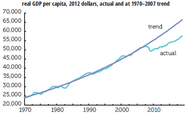
That’s bad news for many reasons, but one is that we have a lot of catching-up to do. My friend Philippa Dunne recently highlighted some IMF research on lingering damage from the financial crisis. Per capita real GDP since 1970 is now running about $10,000 per person below where the pre-crisis trend would now have it. Philippa calculated that at current rates, the economy won’t be where it “should” be until the year 2048.
Source: TLR Analytics
A recession will push us even further below that 1970–2007 trend line. And all the zero interest rate policies (ZIRP) and quantitative easing in the world will not get us back on trend, just as it did not after 2008. No matter how fast we try to run, it will get even harder to catch up with that trendline.
Inversions-R-Us
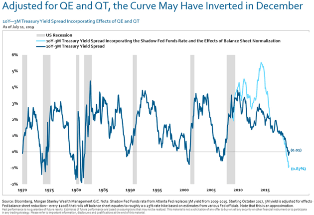
The inverted yield curve is one of the more reliable recession indicators, as I discussed at length last December in The Misunderstood Flattening Yield Curve. At that point, we had not yet seen a full inversion. Now we have, and it appears in hindsight perhaps the curve was “inverted” back then, and we just didn’t know it.
You may recall that the Powell Fed spent 2018 gradually raising rates and reducing the balance sheet assets it had accumulated in the QE years. This amounted to an additional tightening. I said it was a mistake but alas, the Fed didn’t listen to me. In fact, I repeatedly argued that the Fed was running an unwise two-variable experiment by doing both at the same time. Many serious observers wonder which is more problematic for the economy. I think the balance sheet reduction has had more impact than lower rates.
Like what you're reading?
Get this free newsletter in your inbox every Saturday! Read our privacy policy here.
If you assume, as Morgan Stanley does below (and I have seen variations of this from numerous other analysts) every $200B balance sheet reduction is equivalent to another 0.25% rate increase, which I think is reasonable, then the curve effectively inverted months earlier than most now think. Worse, the tightening from peak QE back in 2015 was far more aggressive and faster than we realized.
Let’s go to the chart below. The light blue line is an adjusted yield curve based on the assumptions just described.
Source: Morgan Stanley
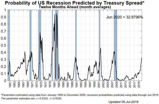
But even the nominal yield curve shows a disturbingly high recession probability. Earlier this month, the New York Fed’s model showed a 33% chance of recession in the next year.
Source: New York Fed
Their next update should show those odds somewhat lower as the Fed seems intent on cutting short-term rates while other concerns raise long-term rates. But it’s still too high for comfort, in my view.
But note that whenever the probability reached the 33% range (the only exception was 1968), we were either already in a recession or about to enter one. For what it’s worth, I think Fed officials look at their own chart above and worry. That’s why more rate cuts won’t be surprising. And frankly, and I know this is out of consensus, I would not rule out “preemptive quantitative easing” if the economy looks soft ahead of the election next year. Just saying…
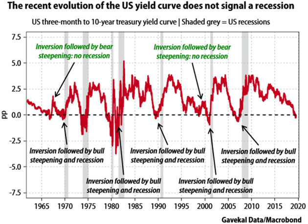
But that’s not everyone’s view. Gavekal gives us this handy chart showing inversions don’t always lead to recession right away. (I noted 1968 above and I think 1998 is a separate issue. But then again, that’s me.)
Source: Gavekal Research
Fair enough; brief inversions don’t always signal recession. But as noted, when you consider the balance sheet tightening, this one hasn’t been brief. Note also that an end to the inversion isn’t an all-clear signal. The yield curve is often steepening even as recession unfolds.
One thing seems certain: While the yield curve may not signal recession, it isn’t signaling higher growth, either. The best you can say is that the mild expansion will continue as it has. That’s maybe better than the alternative, but doesn’t make me want to pop any champagne corks.
Rob Arnott of Research Affiliates is simply one of the finest market analysts anywhere. He has won more awards and accolades than almost anyone I know. I am honored to call him friend and frequently get the benefit of his commentary about my letters or in this case, a note I used in my Over My Shoulder service from a former Fed economist. I’ll let Rob speak for himself:
I’m fascinated that there are so many economists and pundits who think that cutting rates is a bad idea, when many (sometimes the same people!) thought ZIRP was fine for a half-dozen years.
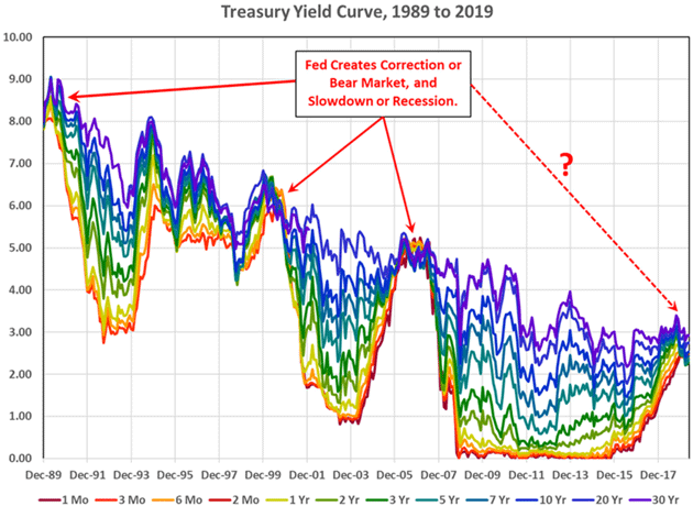
I was struck by Yellen’s recent comments that it’s “very difficult” to bring long rates down. This would seem to lend credence to Bianco’s assertion that yield curve inversion doesn’t “predict” a recession; it “causes” a recession. The “causality” is a controversial idea. My argument: The long end is set by the markets, not regulators. It is high when inflation and/or growth expectations are strong, and low when inflation/growth expectations are low. When the long end falls below the short end (or the short end rises above the long end), the long end is telling us that people are happy to lend long-term at rates lower than the short-term cost of capital and are disinclined to borrow at rates at or above the short-term cost of capital. This probably means some blend of risk aversion and pessimism. The Fed waits until it sees signs of weakness, so it’s always behind the curve. By the time there is objective evidence of weakness, it’s too late for the Fed to do a thing.
This is also why critics are wrong to criticize Steve Moore or Judy Shelton for wanting higher rates before Trump’s election, and lower rates today. The graph below suggests that the long bond was begging the Fed to normalize, within months after the Global Financial Crisis had passed. And is now saying “we’re running out of time to ease.”
Source: Research Affiliates
For what it’s worth, I think an inverted yield curve is similar to a fever. It simply tells us something is wrong in our economic body. And sadly, at least historically, Rob is right. The Fed has always been behind the curve. To Powell’s credit, he may be trying to get in front of it, at least this time. I am less hopeful about the results, for different reasons I will describe in another letter someday.
Freight Freeze
The yield curve and other financial indicators are, while interesting, somewhat disconnected from the “real” economy. What’s happening on Main Street, where real people buy and sell real products used in everyday life? The news isn’t reassuring there, either.
The physical goods we buy—food, clothing, furniture, houses, and most everything else—have one thing in common. They (or their components) travel long distances to reach us. Sometimes it’s from overseas, sometimes domestic, but none of us live in close proximity to all the things we need. The market economy brings them to us.
People have aptly compared the economy’s transportation sector to the body’s circulatory system. It’s a good metaphor. Blood delivers nutrients to your organ just as trucks deliver products to your home. Problems begin when those deliveries slow… and they are.
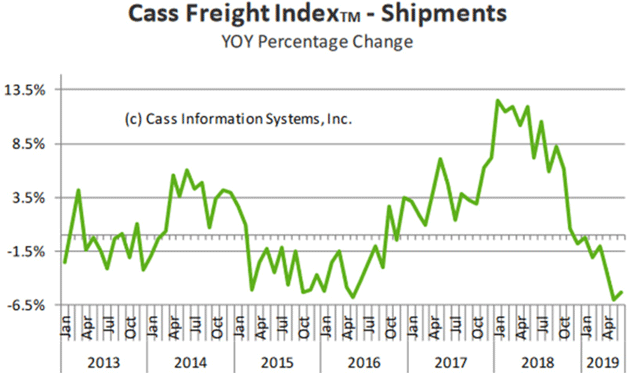
The Cass Freight Index (which I have followed for more than a decade) measures shipment volume (by quantity, not cost) across the economy: truck, rail, air, ship, everything. The chart below shows its year-over-year percentage change.
Source: Cass Information Systems
You can see shipment growth picked up in 2016 following an extended weak stretch. This continued into early 2018 then a steep slide ensued. (Note that this is about the same time as the manufacturing contraction shown in the Goldman Sachs chart above and coincides with the first Trump tariffs.) Annual growth went below zero in December 2018 and has been there ever since—now seven consecutive months.
“What’s the big deal?” you may ask. Look how long that 2014–2016 contraction lasted. It didn’t signal a recession. Two points on that…
Like what you're reading?
Get this free newsletter in your inbox every Saturday! Read our privacy policy here.
First, that retreat sprang from an oil price collapse that began in November 2014 and quickly affected US shale production. This greatly reduced freight volumes.
Second, while it didn’t spark a generalized recession, that particular part of the economy had its very own recession, and it was a nasty one. Ask anybody in the energy business and energy-producing regions how fondly they remember those years.
The current shipment contraction is potentially far worse. We can’t blame it on a sudden event like OPEC opening the spigots, nor is it focused on a particular sector. The Cass data shows declines everywhere, in everything.
Do I blame this on Trump’s trade war? Partially, yes, but I think more is happening. Years of flat wages forced many households to take on more debt. This has a cumulative effect; you can handle the payments for a while, but eventually things happen. Rising interest rates didn’t help. (In casual conversation, a friend told me his American Airlines Citibank card is now charging him 22% even though his credit score is over 800.)
This would once have been a normal pattern, not good but also not alarming. The economy had cycles and we dealt with them. But the long duration and weak magnitude of this growth phase is making the inevitable downturn potentially “feel” worse to many. The pain adds up and eventually becomes a recession.
Action Plan
So if you have investments, what does all this mean for your investments? It probably won’t be good. Stock valuations are historically high relative to our actual income. You might recognize that as Warren Buffett’s supposed favorite indicator: the ratio of stocks to gross national income.
Steve Blumenthal recently shared a good chart on this. He explains it so well, I’ll just quote him.
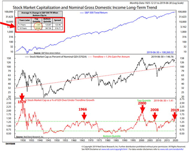
The chart below looks at what Warren Buffett said is his favorite valuation measurement. It compares the total value of the stock market to Nominal Gross Domestic Income. Stock Market Capitalization is the number of shares a company has outstanding multiplied by its current share price. All US companies are calculated and added together to get the total value of US stocks. Think of Gross Domestic Income as what we collectively earn. When stock prices go up, the collective value of the market goes up and when you compare it to our collective income, you get a ratio to determine if prices got ahead of themselves (overvalued) or are cheap relative to our incomes (undervalued).
Ned David Research (NDR) tested the data back to 1925 and organized the ratio of stock market value to income into five quintiles (most overvalued to undervalued).
Here is how to read the chart:
- First focus on the bottom section of the chart. The red line tracks the ratio since 1925.
- Above the green dotted line is the top quintile or most overvalued in terms of stock market price to income. Below is the bottom quintile or where bargains are best. The red arrows mark prior peaks in valuation (1929, 1966, 2000, 2008, and today).
- Next, look at the red rectangle in the upper left-hand section of the chart. Focus in on the yellow circle. It shows the subsequent five-year return achieved when the ratio was in the top quintile (most overvalued) and was just 1.41%. That is the total return after five years, meaning your $100,000 grew to just $101,410. Annualized, that is a compounded return of approximately 0.22% per year. Not good. The 10-year return was just 50.66%, which is an annualized compounded return of approximately 4.25%. Not so good.
- Now look at the subsequent 5- and 10-year returns when the ratio was in the bottom quintile (most undervalued). +123.87% average five years later and +367.36% 10 years later. Pretty great.
- NDR said that no indicator they have tested has done a better job historically at showing subsequent 5- to 10-year returns. We should take note.
Source: CMG Wealth Management
John here again. In other words, when you start matters, and now is not a good time. You want to buy on weakness, not strength. The weakness will come, but this isn’t it.
There is a counterargument, though. Maybe all this history doesn’t matter when we have central banks doing absurd things like negative interest rates. I see real risk that the Fed will go to NIRP before all this ends. Imagine what that will do to the trillions presently stashed in bonds. Will people (not to mention pension funds) happily pay for the privilege of being owed money? If not, where will they put their cash?
The answer, for many, may be in stocks. The resulting money flow could keep equity prices high despite negative fundamentals. I’m not predicting that outcome, but it’s possible.
We are in such bizarre times, all bets are off. It is certainly not the time for “buy and hold” unless your goal is to lose everything. If not, then you need an active, flexible, defensive investment strategy now more than ever.
One caveat: The last two times (2000 and 2006) the Fed cycle was where it is today, stocks actually rose for about six months. In 2006, I painfully remember being on the Larry Kudlow show with Nouriel Roubini where we were both talking about bear markets. Larry and John Rutherford were beating us up, telling us the markets would rally. They were right. Equity indexes went up 20% more after that December 2006 television show, before falling 50% and then some. Which is one reason my own personal strategies are now more nuanced than simply “sell everything and go to cash.” There are ways to properly hedge and still participate in the markets. But that’s another letter…
New York, New York, Maine, and Montana
I thought I was staying home, but Monday finds me flying to New York for two days for last minute meetings while Shane is in Mexico. Then early August sees me in New York for a few days before the annual economic fishing event, Camp Kotok. Then maybe another day in New York before I meet Shane in Montana. Palo Alto is calling, too. So much for the light travel schedule.
Puerto Rico is now home for Shane and I. You may have seen news of large protests in Old San Juan. Everyone pretty much knew the government was corrupt, but recently revealed text messages exposed some disturbing details. The fact that the protests are nearly entirely peaceful (from what I can see) is amazing. The people are right to be outraged.
I have grown to love this island and the people. These are some of the happiest and most welcoming people of the 65 countries that I have visited in my life. A little transparency in their government would go a long way to solving the ills that plague them.
And with that, I will hit the send button. You have a great week and find some friends and family to be with. I’m looking forward to meeting a few friends in New York myself…
Like what you're reading?
Get this free newsletter in your inbox every Saturday! Read our privacy policy here.
Your on recession watch analyst,

John Mauldin
P.S. If you like my letters, you'll love reading Over My Shoulder with serious economic analysis from my global network, at a surprisingly affordable price. Click here to learn more.
Put Mauldin Economics to work in your portfolio. Your financial journey is unique, and so are your needs. That's why we suggest the following options to suit your preferences:
-
John’s curated thoughts: John Mauldin and editor Patrick Watson share the best research notes and reports of the week, along with a summary of key takeaways. In a world awash with information, John and Patrick help you find the most important insights of the week, from our network of economists and analysts. Read by over 7,500 members. See the full details here.
-
Income investing: Grow your income portfolio with our dividend investing research service, Yield Shark. Dividend analyst Kelly Green guides readers to income investments with clear suggestions and a portfolio of steady dividend payers. Click here to learn more about Yield Shark.
-
Invest in longevity: Transformative Age delivers proven ways to extend your healthy lifespan, and helps you invest in the world’s most cutting-edge health and biotech companies. See more here.
-
Macro investing: Our flagship investment research service is led by Mauldin Economics partner Ed D’Agostino. His thematic approach to investing gives you a portfolio that will benefit from the economy’s most exciting trends—before they are well known. Go here to learn more about Macro Advantage.
Read important disclosures here.
YOUR USE OF THESE MATERIALS IS SUBJECT TO THE TERMS OF THESE DISCLOSURES.
Tags
Did someone forward this article to you?
Click here to get Thoughts from the Frontline in your inbox every Saturday.

 John Mauldin
