
When Valuations Collide…
-
 John Mauldin
- |
- March 7, 2025
- |
- Comments
- |
- View PDF
 John Mauldin
“Stock prices have reached what looks like a permanently high plateau.”
—Yale economist Irving Fisher 12 days before Black Monday in October 1929
“Wall Street indexes predicted nine out of the last five recessions!”
—MIT professor Paul Samuelson in 1966
Last week, we explored the Crestmont Stock Market Matrix and its insight into the drivers of stock market returns. The graphic resembles an assembled jigsaw puzzle with enlightening messages about realized returns over multi-decade investment periods.
Today I will again join forces with Ed Easterling of Crestmont Research to explore this data more deeply. Currently we have several powerful trends that have combined to create a nirvana-like market. We will give you the data and you can decide whether those trends can continue or not. We'll explore together an unassembled puzzle of economic and corporate data. We’ll also look at a number of charts, all as accurate as possible, describing the various economic realities we and the markets will face in the coming years.
We'll seek to put enough pieces together to understand the economic and market environment that may be approaching. Beware, we're headed into provocative territory.
Recession Signal?
To start with, let’s set the table with the current economic situation. The Atlanta Fed recently dropped a surprising bombshell. On February 19th, their model’s estimate for Q1 real GDP growth was +2.3% (seasonally adjusted annual rate). Last Friday, the GDPNow forecast was revised down to -1.5%. That's not a typo—it swung from positive to negative.
(The Atlanta Fed GDPNow number is based on a mathematical relationship of dozens of economic indicators released during the quarter, revised in nearly real time with each data release. It can change sharply during the quarter. I find it useful as a trend indicator—certainly more useful than “blue-chip economists” who tend to run in herds.)
Based on economic reports released Monday, March 3, GDPNow revised the forecast for Q1 ’25 GDP to a negative -2.8%. Yesterday (Thursday), following additional economic reports, the forecast bounced slightly to -2.4%.
Today, the Atlanta Fed appears pessimistic compared to human forecasters. As the nearby chart shows, not long ago, GDPNow was the clear optimist. We may be witnessing a battle between very tight psychological anchoring among a large group of Blue Chippers versus an unconstrained AI model… time will tell.
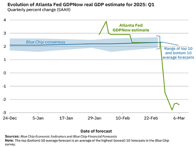
Source: Atlanta Federal Reserve Bank
The New York Fed has a different method they call their “Nowcast.” It runs about two weeks behind the Atlanta model and is still showing around 3% Q1 growth. But two weeks ago the Atlanta number was also comfortably in positive territory.
How accurate is the Atlanta Fed number? They quite transparently tell you. Here is their tracking error.
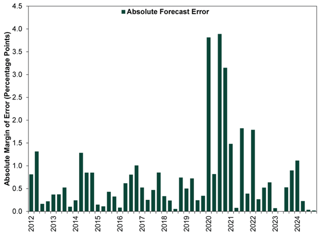
Source: Federal Reserve Bank of Atlanta
Note that with the exception of the COVID-influenced periods, the tracking error was generally 1% or less, either up or down. If you add 1-1.5% back into that GDP number as tracking error, it is still negative for the quarter. But there is a lot of data still to come out in the next three weeks.
At this point, we have a hazy outlook, at best, for Q1 ’25 GDP. Nonetheless, storm clouds have moved in. Where else can we look for data that might affect stock market returns?
Earnings Conundrums
Since corporate profits emanate from corporate sales, let's explore measures of current and projected corporate profits.
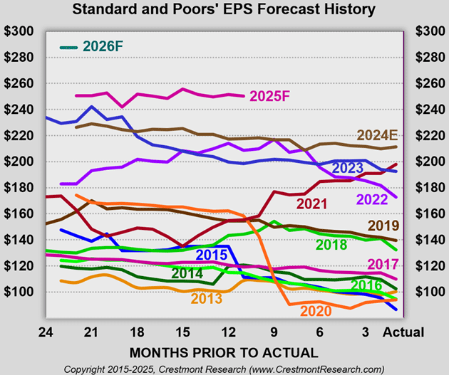
Last week, Standard and Poor's updated their 2025 forecast for S&P 500 quarterly earnings per share (EPS). The update also included quarterly forecasts for 2026. Crestmont Research incorporated S&P's projections into its EPS History & Trends chart.
The main body of the chart includes EPS reports since 1970 and forecasts through 2026. The historical reports are shaded with dark blue. The forward-looking values are shaded brown (2024 estimated), pink (2025), and teal (2026). The 2025 surge reflects EPS growth of 18%, followed in 2026 by additional gains of 15% for a cumulative 36% increase! Such growth is not unprecedented, but that dramatic change follows already sizable gains over the past several years. We will dive deeper into this chart, as it has a lot of things we need to understand.
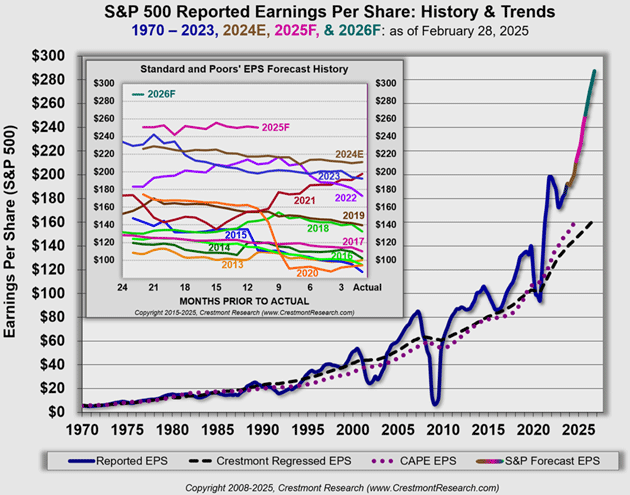
Source: Crestmont Research
Like what you're reading?
Get this free newsletter in your inbox every Saturday! Read our privacy policy here.
Two dashed lines are included as trendlines for normalized EPS. Normalized means the data has been adjusted to smooth the business cycle of fluctuating earnings, partially by averaging the data over 10 years. The black hashed line is Crestmont Research's GDP-regressed normalized EPS which allows for forecasts. The purple dotted line is the implicit EPS from Robert Shiller's CAPE P/E 10 which is only backward looking. Both are useful.
The two methodologies use unrelated approaches to normalize EPS, yet they produce only slightly different results. The relative consistency between the two measures, however, validates their reasonableness.
Why smooth the valuations? P/E ratios can become enormously volatile, especially during recessions. You can see a P/E ratio rise above 60 briefly as earnings collapse. That’s just not useful for any real analysis. It would distort the picture.
In our chart, note that historical EPS fluctuated around the normalized measures for five decades from the 1970s through the 2010s (as it has for almost every decade since 1900). It recovered quickly after the Great Recession of 2007–2009, then remained slightly elevated near or above the normalized measures during the 2010s.
Then, blast off! The short COVID-related EPS pullback in 2020 acted as a slingshot upward. Extremely aggressive fiscal and monetary policy has pushed EPS well above the normalized baseline.
Last week, we included a chart from the St. Louis Fed's FRED data site. The chart presented corporate profits relative to a surrogate for GDP (GDI or Gross Domestic Income). In effect, the chart shows corporate profits relative to aggregate sales. That ratio is a measure of corporate profit margins.
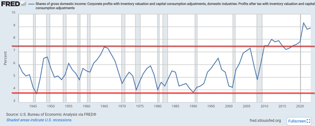
Source: FRED (with red lines added)
The chart includes private and public companies. According to Cole Campbell and Jacob Robbins (University of Chicago), public and private companies each account for approximately half of the aggregate sales and profits of the US economy.
Like Crestmont's EPS chart, the recent surge in corporate profit margins has dramatically driven the measure out of its 70-year channel. The FRED chart emphasizes the historical significance of the past five years.
There are significant implications from combining the information from Crestmont's EPS chart with the FRED profit margin chart. The EPS forecast from S&P included in the Crestmont chart shows earnings increasing 36% over the next two years. Since public and private companies have each represented about half of the sales and earnings in aggregate corporate profits, let's assume private companies have margins similar to public companies over the next few years.
Also, let’s assume nominal GDP growth averages 5.5% during each of the next two years (2–3% growth and 2–3% inflation). If so, the profit margin line in the FRED chart would mathematically have to increase to approximately 11% if earnings are to reach $287. That level would be approximately twice the average for 1940–2010 and a major breakout above the channel for the same period.
Most important, for stock prices and future returns, it may not be reasonable to assume current profit margins are sustainable. Since EPS growth is one of the three components of stock market returns, a reversion of profit margins could significantly detract from returns.
Further, note the shaded recession bars in the FRED chart. Profit margins are most susceptible to downward adjustment going into recessions. The two-month technical recession in early 2020, as COVID shocked the world, barely reset the profit cycle. Now that profit margins have reached such extreme heights, it may take another recession to reset profit margins. Alternately, time may confirm some currently unknown factor(s) that justify an upshift in the profit margin channel.
Market Multiplier, Multiple Expansion
Beyond EPS, the other driver of stock market gains and losses is the price/earnings ratio (P/E). Many factors affect P/E, including investor sentiment, economic growth rates, inflation, and others. P/E is particularly significant because the multiplier effect applies to total earnings, not just earnings growth. This is called multiple expansion and has been the primary driver of the recent bull market. Across historical investment periods, sometimes P/E has more than doubled returns from EPS alone (multiple expansion), and other times, it has more than offset EPS growth.
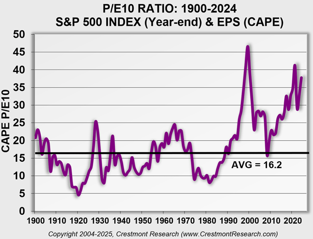
Source: Crestmont Research
The above chart titled "P/E10 Ratio" presents a measure of P/E using the methodology popularized by Robert Shiller (Yale). P/E 10 is inflation-adjusted and smooths the variability of EPS across business cycles. Without normalizing, years with EPS dips would show artificial surges in P/E since EPS is the denominator in the ratio.
|
P/E has had its ups and downs over more than 12 decades. Over time, conditions drove P/E to cycle between single digits and near the mid-20s. The culmination of the tech bubble in 1999 surged P/E above its previous peak in the Roaring '20s. Today's value of 38 is less than one point shy of being the fourth-highest value for P/E in the past 125 years.
P/E is currently more than twice its historical average. And, saving the geeky details for a later time, the current P/E 10 would likely be the highest on record if profit margins were not elevated above the 70-year channel in the FRED chart.
Like what you're reading?
Get this free newsletter in your inbox every Saturday! Read our privacy policy here.
The relative level of P/E is important because P/E is the most significant factor affecting subsequent returns. As P/E rises, dividend yield falls. The current level of P/E has dividend yield at less than one-third of the historical average. That removes a lot of the juice from total returns.
Also, an elevated P/E is more prone to fall than an average or below-average P/E. A decline in P/E over an investment period decreases returns.
The following table highlights the effect of P/E on subsequent returns. The analysis organizes the 116 ten-year periods since 1900 into deciles (10 equal portions) based on total return (i.e., index gains plus dividend yield). Each decile consists of 11 or 12 periods. The table reflects the lowest and highest return for each decile. In addition, the fourth column shows the average return for each decile. The last two columns reflect the average P/E at the start of the 10-year periods in each decile and the average ending P/E.
The closest peer to today's environment is the first decile. We say "closest" because, for perspective, the 10-year period starting in 2025 starts with a P/E of 38 (the 2024 year-end P/E), well above the 26.6 average.
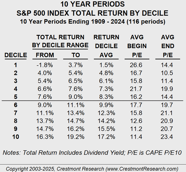
Source: Crestmont Research
These comments are not intended to be alarming. We can't predict the future, and there could be factors making today's environment different from the past century. At most, consider these sobering comments as encouragement to review portfolio holdings and exposures.
Now let's dig into some of the risks.
Concentration Risk
One of the top principles of prudent investing is diversification. Research published by Lawrence Fisher and James Lorie in the 1970s determined that 32 stocks achieved 95% diversification. Subsequent research and analyses have concluded that similar diversification can be achieved with 20 to 30 stocks. As with most rules of thumb, assumptions matter.
Mutual contribution is the primary concept in studies on diversification. Whether the analogy is a multi-cylinder engine or a team of rowers in the crew boat, the stocks in a portfolio should have some level of relatively similar contribution to returns. That doesn't mean each stock should have the same weight, but it does mean that no stock or set of stocks should dominate the portfolio if a major objective is diversification.
David Bahnsen is the Chief Investment Officer and Managing Partner of The Bahnsen Group. His recent weekly letter (which is fascinating reading, you should subcribe!) astutely contrasts five factors in the market.
His first point relates to valuation—that valuation matters, and it doesn't. David highlights that valuation matters when investing across the overall market. Such a portfolio diversifies away company risk and embraces market risk (i.e., beta). When market risk is your investment, the measures of market valuation (e.g., P/E) matter a lot.
In contrast, David's approach to investing involves the diligent selection of companies based on other value measures. Quoting David:
"I care not a whit about not participating in certain excess moves forward of companies outside our philosophical orientation, and identify valuation in the dividend yield, the Free Cash Flow Yield, and the growth of the Free Cash Flow and actual dividend payouts, themselves—not the stock prices."
For David, value matters much more than valuation. The second point in his letter builds on his first. Diversification and concentration don't mix. His portfolios are built with a range of allocations for effective diversification.
"We have companies that are 4% of our portfolio and companies that are 1.5% of our portfolio, and various weightings in between, but we do not have companies that are 6% while others are 0.01%. Each company has attribution to the result, positive and negative, and the diversification reality is no different in concentration, weighting, and attribution than it has ever been."
For today’s index investor, however, concentration has begun to dilute diversification. A small group of companies have increasingly dominated the supposedly diversified S&P 500. Historically, that basket of 500 stocks was highly diversified. In recent years, however, an investor with a mutual fund or ETF comparable to the S&P 500 effectively has 40% of their investment concentrated in 10 companies and 60% diversified across 490 companies.
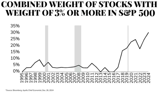
Source: David Bahnsen
Since the performance of the concentrated set has exceeded the overall market, investors have benefited thus far. However, this sword has two edges, and the increased concentration may be its own indicator. The fact that such a small group of companies has become such an overweighted portion of the market may indicate a speculative overvaluation. Thus, be aware of the current embedded concentration in portfolios. In addition, be mindful that such concentration may be in stocks with potentially above-average risk. Unless you want that risk, which should be a decision and not a passive result, be aware!
If Things Can’t Continue, What Stops?
John here. We don’t know the future but it’s hard to reconcile the fact that for earnings to grow to $287 on the S&P 500 we would have to see 11% corporate profit margins—assuming that the economy rolls along in the 5 to 6% nominal GDP range without a hiccup. So what could change?
First, and historically most likely, those earnings estimates could fall. I am going to highlight a portion of our first P/E chart, the history of earnings forecasts by year.
Source: Crestmont Research
Like what you're reading?
Get this free newsletter in your inbox every Saturday! Read our privacy policy here.
Note that in general, a given year’s earnings estimates trend down over the year. Sometimes not much at all and sometimes dramatically. An exception would be 2021, coming off a terrible 2020 when earnings dropped from $170+ to under $100. Analysts predicted that earnings in 2021 would come back to that $170 range. Over the year the earnings estimates continued to drop to below $140, then jumped up to almost $200 by the end of the year. Good times.
2023 saw another large forecast jump but it trended down as well. Now we have a situation where the 2025 forecast sees a large jump from 2024 and a monster jump for the 2026 forecast.
While it is entirely possible that profit margins go to 11% and earnings rise to $287 for 2026, I won’t hold my breath. What is more likely is that earnings estimates and reality both fall, like they typically do. In fact, earnings estimates could drop significantly while the market goes sideways as P/E ratios stay the same.
Or an economic pullback could reduce earnings and animal spirits. We simply don’t know. What we do know is that for corporate profit margins to be 11.5% and earnings to be $287 by the end of 2026, the entire country would somehow become the most efficient allocators of capital in human history in just two years. That’s what some breathless proponents of artificial intelligence say will happen, just not in the next two years. And are we going to become this efficiency machine in the midst of the economic turmoil that seems part of our current landscape?
I am not saying to get out of the stock market. But rather than being invested in the “stock market” I would suggest that you invest in particular strategies and stocks. I like high and growing dividends paired with curated alternatives. I have friends who have been quite successful in investing in small defense-oriented tech stocks. Others look at special situations and do their own work. But they do it with a strategy and an understanding of the risks.
The dividend strategy that I like has significant risks. Typically such a strategy recovers quicker than indexes, but it is not a bank CD. My friends who trade their own very idiosyncratic portfolios spend a great deal of time focusing on the risks they assume.
If you are not spending a great deal of time on your own portfolio and in-depth analysis, then maybe you should consider getting someone to do that for you. There are a lot of great managers out there with very diverse strategies. But what I would not do is allocate new capital to an index fund and, depending on your tax situation, would consider lightening up. (If you have 15 years of capital gains you have to take that into consideration.)
The historical data suggests that index market returns are going to be muted for the next 10 years. But remember, even during the first decade where returns were flat for the decade, there was a three-year bull market for the stock market doubled. Time horizons matter.
In short, longtime readers know I expect a debt crisis by the end of the decade. Volatile markets are highly likely. You have the opportunity to prepare a strategy to get you through that period. There are multiple options. But choose one rather than passively accepting whatever the market gives you, because the market can both give and take away.
Many investors don’t have the stomach for big drawdowns and get out at the wrong time. Think through what you want to do. Write it down. But most of all, make a decision. If you are uncomfortable making your own decision, then find someone you can trust to help you make that decision.
And as Sgt. Phil Esterhaus of Hill Street Blues reminded us every week, “Let’s be careful out there.”
Palm Beach, Dallas, and DC
Shane and I will be in West Palm Beach this next week. We will have dinner with my great friend Barry Habib and Rosa on Tuesday. Barry is the best at mortgages and interest rates in the world and one of just the nicest human beings ever. He has gone through two severe cancer therapies and thankfully seems to have fully recovered. His treatments are a wonder of modern medicine. Ten years ago and maybe even 5, he would not have made it. Then the next day is full of meetings ending with a client dinner with David Bahnsen of TBG (and many of my readers as well). Hopefully some time with Doug Kass.
Sometime later in the month I’ll be in Dallas and then in DC for a longevity conference in late April (details to come).
It is time to hit the send button. Have a great week and spend some time with family and friends, where true wealth is!
|
Your writing more than ever analyst,

John Mauldin
P.S. If you like my letters, you'll love reading Over My Shoulder with serious economic analysis from my global network, at a surprisingly affordable price. Click here to learn more.
Put Mauldin Economics to work in your portfolio. Your financial journey is unique, and so are your needs. That's why we suggest the following options to suit your preferences:
-
John’s curated thoughts: John Mauldin and editor Patrick Watson share the best research notes and reports of the week, along with a summary of key takeaways. In a world awash with information, John and Patrick help you find the most important insights of the week, from our network of economists and analysts. Read by over 7,500 members. See the full details here.
-
Income investing: Grow your income portfolio with our dividend investing research service, Yield Shark. Dividend analyst Kelly Green guides readers to income investments with clear suggestions and a portfolio of steady dividend payers. Click here to learn more about Yield Shark.
-
Invest in longevity: Transformative Age delivers proven ways to extend your healthy lifespan, and helps you invest in the world’s most cutting-edge health and biotech companies. See more here.
-
Macro investing: Our flagship investment research service is led by Mauldin Economics partner Ed D’Agostino. His thematic approach to investing gives you a portfolio that will benefit from the economy’s most exciting trends—before they are well known. Go here to learn more about Macro Advantage.
Read important disclosures here.
YOUR USE OF THESE MATERIALS IS SUBJECT TO THE TERMS OF THESE DISCLOSURES.
Tags
Did someone forward this article to you?
Click here to get Thoughts from the Frontline in your inbox every Saturday.