Your Own Personal Inflation Rate
-
 John Mauldin
- |
- November 1, 2015
- |
- Comments
- |
- View PDF
Always & Everywhere?
All-Consuming Price Index
Is “Real” Inflation Higher?
Alternative Inflation
Inflation, Fed-Style
Atlanta, Miami, And Home
“Inflation is as violent as a mugger, as frightening as an armed robber, and as deadly as a hit man.”
– Ronald Reagan
“To me, a wise and humane policy is occasionally to let inflation rise even when inflation is running above target.”
– Janet Yellen
The US economy grew at a 1.5% inflation-adjusted rate in the third quarter, or so said the Bureau of Economic Analysis in its first GDP estimate last week. The number is subject to revision and will probably change. Based on recent experience, revisions could easily push it below 1% or above 2%. Since this is “real” GDP, it also depends on inflation numbers. BEA doesn't use the familiar Consumer Price Index for this purpose – CPI comes from an entirely different agency, the Bureau of Labor Statistics.
You can get quite different real GDP growth numbers if you use the inflation figures calculated by the Dallas Federal Reserve Bank. The Dallas Fed developed something called trimmed PCE, the use of which would make real 3Q GDP growth 1.1%. Or, if we all decided that the calculation of “median CPI” performed by the Cleveland Fed was what we should use, then GDP growth was about 0.3%. (Which is of course why we don’t use it!)
And gods forbid we use the method employed in Europe for calculating inflation. Evidently, housing is not a very big deal in Europe, so it is a much smaller component of the inflation calculation; and if you can believe it, the Europeans actually use an archaic methodology for calculating housing inflation that involves the real prices of home sales, as opposed to a totally artificial guesstimate called Owner’s Equivalent Rent, used by more sophisticated countries like the United States. If we had done things the European way, inflation would have been sky-high during the last decade, and the Federal Reserve would have been forced to raise rates rather than holding them under 1% for far too long. And who knows where the inflation rate would have gone if we hadn’t pricked our little housing bubble.
This week’s letter is all about how we create the sausage that is called inflation. The Fed has a target of 2% inflation. Aren’t we almost there at +1.9% CPI? Not really, as the Fed uses something called the PCE, and it is barely at +1.3%. Which is different again from other measures of inflation. Confused? Hopefully, we can make sense of inflation today and have some fun along the way with crazy government statistics.
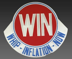
If, like me, you are ancient enough to remember the 1970s, you will recall that inflation was Economic Enemy #1. Presidents Gerald Ford and Jimmy Carter spent most of their terms trying to Whip Inflation Now. Their inability to tame it is one reason neither had a second term.
Fast-forward to the twenty-teens. Inflation is still top of mind, but this time it’s because we don’t have enough of it. The Federal Reserve and every other central bank on the planet now wants to enlist inflation in the fight against the present foe, deflation. I guess that instead of the buttons that Gerald Ford passed out, which read “W-I-N,” central bankers could pass out a button with “(C)BAD,” for “Central Bankers Against Deflation.”
All this points to a question: Exactly what is inflation, and how do we measure it? The correct answer is not at all obvious, though plenty of people think it’s obvious. They vigorously defend their chosen answers, too. Today we will consider some different inflation measures. None fully satisfies, but for a variety of reasons we actually do have to make the attempt to measure inflation. It is really very important to investors, savers, and people in general.
So what is inflation, and what causes it?
Milton Friedman famously said, “Inflation is always and everywhere a monetary phenomenon.” Those who quote the statement often omit the rest of Friedman’s sentence: “… in the sense that it cannot occur without a more rapid increase in the quantity of money than its output.”
The rather famous research paper that Saint Friedman co-wrote clearly demonstrated the rather tight linkage between money supply and inflation. Except that the time frame over which the authors analyzed money supply and inflation was a rather stable period for the velocity of money. Irving Fisher’s equation (MV = PT), developed in the early ’30s, clearly demonstrated the relationship between prices and the velocity of money. Towards the end of his life Professor Friedman began to acknowledge the importance of the velocity of money in dealing with inflation.
That said, to describe inflation we must do more than just blame central bankers for a too-loose money supply. If the Fed, BOE, BOJ, and ECB had pushbutton control over inflation, don’t you think they would have pushed the button by now? The fact that they have not indicates that their control is not as complete as we sometimes think. The fact that three of the four above-mentioned central banks are worried about inflation being too low, even though their monetary policies are ridiculously easy, indicates that something else is going on. There are clearly other parts to the inflation equation.
Definitions of inflation vary a lot, but a basic definition that I like is that inflation is an artificial increase in the money supply that leads to higher prices for goods and services.
Do rising prices cause inflation, or are they symptoms of it? I think they are symptoms, but good people disagree on the underlying cause.
By the way, we have a new article that explores this question on the Mauldin Economics website: “What is Inflation?” Check it out. It is part of a series my team is developing to answer some common economics questions.
Like what you're reading?
Get this free newsletter in your inbox every Saturday! Read our privacy policy here.
Measuring something whose definition is cloudy can be an exercise in futility, but economists do it anyway. (Yet another reason people call economics “the dismal science.”) For practical purposes, most people look to the Consumer Price Index (CPI) and its variants for a read on inflation. The Fed prefers a different measure, the Personal Consumption Expenditure (PCE) Index, which they also use as the “GDP deflator.” We will deal with this in greater detail in a bit, but basically the Bureau of Economic Analysis calculates what we refer to as nominal GDP growth and subtracts the GDP deflator from that number to get “real GDP,” that is, inflation-adjusted GDP. When you read about GDP in the media, it is almost always real GDP. The 1.5% that was posted this week was real GDP growth, and the GDP deflator was 1.3%, so nominal GDP growth was 2.8%.
Inflation is defined and measured differently by any number of US government agencies. Add in other governments and transnational institutions that produce economic data, and we have scores of different ways to measure inflation. (As mentioned above, Europe’s approach to calculating inflation is far different from the one used here in the US. If we were to use Europe’s methodology, we would now be screaming about deflation concerns.)
Amid this cacophony, suspicions inevitably arise that someone must be cooking the books. Are they? Not really, but people have different priorities. They seek definitions that best match how they intend to use the information they assemble.
Just as stock index investors can choose from different proxies – the S&P 500, the Russell 1000, or the NASDAQ Composite – those who want to study inflation can do so, too. Observers like us can draw better conclusions if we know the differences among them.
The inflation measure we hear most often in the US is the Consumer Price Index. It comes from the Bureau of Labor Statistics. Officially, it is “a measure of the average change over time in the prices paid by urban consumers for a market basket of consumer goods and services.”
That sounds comprehensive – but it’s not. CPI measures what urban consumers pay for a “market basket.” It tells you nothing about the price of the same basket in a rural area. For the record, Europe attempts to measure pricing in rural areas. They calculate something called the Harmonized Index of Consumer Prices (HICP). Actually, the HICP does not fully incorporate rural consumers since it only uses rural samples for creating weighted averages; prices are often collected only in urban areas. But at least they try.
What’s in the US basket? BLS surveys 7,000 families each quarter to find out what they buy, which BLS statisticians say is a sample large enough to be reasonably accurate. From this data, BLS compiles a basket of goods and services, classified in 200 categories and subcategories. The general categories are
- FOOD AND BEVERAGES (breakfast cereal, milk, coffee, chicken, wine, full service meals, snacks)
- HOUSING (rent of primary residence, owners' equivalent rent, fuel oil, bedroom furniture)
- APPAREL (men's shirts and sweaters, women's dresses, jewelry)
- TRANSPORTATION (new vehicles, airline fares, gasoline, motor vehicle insurance)
- MEDICAL CARE (prescription drugs and medical supplies, physicians' services, eyeglasses and eye care, hospital services)
- RECREATION (televisions, toys, pets and pet products, sports equipment, admissions)
- EDUCATION AND COMMUNICATION (college tuition, postage, telephone services, computer software and accessories)
- OTHER GOODS AND SERVICES (tobacco and smoking products, haircuts and other personal services, funeral expenses).
The CPI also includes any taxes associated with purchasing these goods and services. Sales tax counts towards CPI. Income and Social Security taxes do not. So if your income taxes go up and you have less money to spend, that’s not counted as inflation. The federal government assumes that only state sales taxes are inflationary. Just saying…
Every month, BLS employees go shopping to see how much all the items in the basket cost. Then they combine all the numbers, and presto, they have a good start on the CPI number. Well, not exactly presto; it’s actually a very complex and time-consuming process to get all the data collected. But when they’re done, you can actually drill down, if you’re truly bored, and figure out what the inflation figure might be for your state or region. There can actually be a 1% difference from state to state in inflation.
BLS also goes through a whole series of adjustments for seasonality and “hedonic quality.” Hedonic adjustment is a fancy way of saying “higher quality.” I’ve been buying work computers for years. It seems to me that I always spend around $2,000. The computer I can buy for that amount today is far better than the computer the same $2000 bought three years ago and light years better than what I got for my money 10 or 15 years ago. Hedonics tries to account for this.
Since the amount of computing power I’m buying for my $2000 has increased exponentially over the last 15 years, the BLS assumes that the cost of a basic computer has gone down. And I guess that might be true, as there are a lot of basic computers you can buy for $500, and some pretty good ones for a little over $1000. But I find the software demands imposed just by Microsoft, plus the other goodies it takes to actually have a computer that doesn’t make me sit around and wait, still cost about $2000.
So has my cost of living with regard to computers actually changed? Not much. But the BLS says it has when they figure CPI. I’m sure you have examples of things like that in your own life, where the quality of your purchases is much better, but you are still spending roughly the same amount of money. The last car I bought was dramatically superior to the one I purchased seven years previously. The two cars were roughly the same size and cost about the same. But the BLS would assume that the price had gone down because the quality and number of cool features went up.
CPI is actually quite an important number because it is what determines annual cost-of-living adjustments for Social Security recipients, federal employees, and assorted other groups. Many union contracts and other private transactions use it, too – even though BLS itself says CPI doesn’t measure the cost of living. This is from their CPI FAQ page:
Is the CPI a cost-of-living index?
The CPI frequently is called a cost-of-living index, but it differs in important ways from a complete cost-of-living measure. BLS has for some time used a cost-of-living framework in making practical decisions about questions that arise in constructing the CPI. A cost-of-living index is a conceptual measurement goal, however, and not a straightforward alternative to the CPI. A cost-of-living index would measure changes over time in the amount that consumers need to spend to reach a certain utility level or standard of living. Both the CPI and a cost-of-living index would reflect changes in the prices of goods and services, such as food and clothing, that are directly purchased in the marketplace; but a complete cost-of-living index would go beyond this role to also take into account changes in other governmental or environmental factors that affect consumers’ well-being. It is very difficult to determine the proper treatment of public goods, such as safety and education, and other broad concerns, such as health, water quality, and crime, that would constitute a complete cost-of-living framework.
Measuring the actual “cost of living” is too hard even for BLS, apparently. Everyone uses CPI as the next best thing.
This reality brings us to an important point. Whenever I mention inflation, people leap to tell me that it’s far worse than CPI says. They may be right, too, in their own case. We often forget that CPI measures an average set of expenses for 330 million people. Very few of us have household spending patterns that match the average. Older people spend more on prescription drugs. Wealthy people spend more on leisure and travel. People in the suburbs and rural areas spend more on gasoline. College students spend more on education. Vegetarians spend nothing on meat but more on vegetables; so not only do they not buy steak, they are not substituting chicken for steak if the price of steak gets high, which is another hedonic adjustment the BLS makes. The list of variations and exceptions goes on forever.
Like what you're reading?
Get this free newsletter in your inbox every Saturday! Read our privacy policy here.
As with any average, CPI will rarely match the individual cases that make up the average. Your own personal inflation rate will be higher or lower, depending how you spend your money.
If your think your cost of living has gone up more than the miniscule amounts CPI has increased in recent years, you are probably right. This doesn’t make CPI wrong or useless. It’s a statistic. Like all statistics, it has limitations, and I can almost guarantee you that we will be measuring inflation in significantly different ways in 20 to 30 years.
My Mauldin Economics colleague Tony Sagami had an excellent Connecting the Dots article earlier this month on the latest inflation reports. He pointed out that basic grocery staples are rising in price, as shown by the Wisconsin Farm Bureau’s semiannual “Marketbasket” survey.
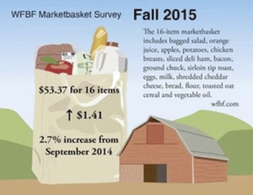
The group’s survey showed prices for the basic grocery list rising 2.7% in the last year. The full breakdown since the spring survey is especially interesting.
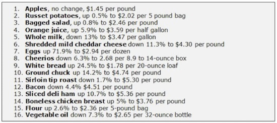
The six-month changes in prices range from a 72% jump in eggs to a 13% drop in milk. Several other items had double-digit percentage changes.
I show this list to illustrate how differently we can perceive inflation. A hearty-breakfast devotee who ate eggs (up 72%) and toast (+25%) had a significantly different breakfast inflation experience from someone who liked their daily Cheerios (down 6%) and milk (down 13%).
Extend those differences to other goods and services and you can begin to see why “average” inflation never precisely reflects our own individual situations. We all spend our money differently.
Many people have constructed alternative inflation measures to correct what they perceive as flawed and/or manipulated government statistics. One of the best known is Shadow Stats. The publisher, John Williams (who is a really nice guy), believes the 1990s introduction of hedonic adjustments artificially depressed CPI. There have also been other changes to how CPI is calculated that Williams takes issue with.
The problem is that using the 1990 methodology shows inflation to be almost 4% higher than the CPI has it today, and using 1980s methodology shows it to be better than 7% higher. I have a great deal of trouble believing those levels could be real, because long-term bond investors tend to be fairly sophisticated and none of them would buy a 30-year bond at 3% if inflation was running 5–6% a year. The Federal Reserve can greatly influence the shorter end of the curve, but at the longer end the curve is still market-driven.
Further, there are many economists with a specialization in inflation statistics who feel that CPI actually overstates current inflation.
Another alternative inflation measure is MIT’s Billion Price Project. They measure price inflation in 22 world economies by gathering prices online every day. This has the potential to be much more precise than CPI; but over time, it has actually tracked CPI closely, as the following graph shows.
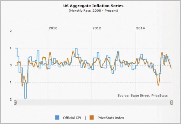
The ShadowStats alternative CPI also highly correlates to official CPI, perhaps because it is simply the same number with an upward boost to remove the hedonic and other adjustments Williams believes are unnecessary or bogus.
Again, I respect what Shadow Stats tries to do, but I disagree with it. Changes in the US economy have been affecting statistics for many decades. The transition from an industrial economy to an information-based economy sped up the pace of change. The quality of electronic devices, among other technological marvels, improved far faster than the quality of eggs or lawnmowers. Hedonic adjustment tries to account for this disparity. Is it perfect? No, but pretending the economy hasn’t changed is not a good option, either.
We all need to let go of the fantasy that economic statistics are perfect. They’re never perfect. Each monthly CPI number is a snapshot of a moving target. Of course, it’s blurry. Of course, you don’t see the other activity that occurred outside the frame. Of course, the quality of the picture depends on your camera, the light conditions, and many other factors.
Like what you're reading?
Get this free newsletter in your inbox every Saturday! Read our privacy policy here.
None of this means the photographers are dishonest and showing us fakes. It more likely means we expect too much from our stats. But despite all their limitations, those numbers can help us if we use them properly.
There are a number of very sincere economists and statisticians who get together often and debate the very arcane topics surrounding inflation. They are very earnest and are really trying to get it right. And the reality is that the various numbers we get are pretty much the best we can do. The way we calculate inflation and GDP changes all the time. Earlier this year, the BEA announced that they are going to start using seasonality in figuring GDP, trying to get rid of what has become a noticeable first-quarter downward pressure on GDP. I’m not certain that a cosmetic change to GDP will actually improve the quality of our economic data, but it looks like we’re going to get it anyway.
Knowing that our best economists make it up as they go along is not comforting, of course. There are those of us who would like to believe that somewhere a little man is sitting behind a curtain, pulling levers to make the economy move. Then we could understand the economy simply by understanding the little man.
The reality is that there is no one behind the curtain. There’s not even a curtain. There is a planet full of people with all manner of resources and desires. The myriad ways they interact with each other add up to a global economy.
Finally, we need to talk about the Fed’s preferred measure of inflation, the Personal Consumption Expenditures Price Index. PCE is broader than CPI and comes from an entirely different agency, the Bureau of Economic Analysis. The PCE uses a different weighting methodology and includes a wider range of payments. Unlike the CPI, the PCE is not based on a fixed basket of goods and services; instead, the PCE’s “basket” changes from year to year with people’s consumption and investment patterns.
Medical expenses are one prime difference between the two indexes. CPI includes only the consumer’s out-of-pocket expenses, i.e. copayments and deductibles. The PCE adds in the full cost of medical care, including the part that your employer, insurer, or Medicare pays on your behalf.
Another difference is that CPI changes the weighting of its market basket only every two years. PCE, on the other hand, uses “chained weighting” that adjusts more quickly. This may be one reason the Fed prefers it to CPI.
Generally, CPI will probably be closer to what consumers experience in their own household spending, while PCE better reflects price changes over the entire economy. This in theory makes PCE more useful for the Fed’s purposes. Interestingly, the difference between core PCE and core CPI (the index without energy and food) is now at its widest in history – 0.6%.
At the beginning of the letter I speculated about whether recent GDP growth was 1.5% or 1.1%, depending on the inflation index used as the GDP deflator. I should also point out that the average change from the first estimate of GDP until the number is “final” 60 days later is 0.6%, either up or down. The reality is that any number to the right of the decimal in either GDP or CPI is an approximation. Some people think it is evidence of a sense of humor in economists that they actually talk with a straight face about tenths of a percent of GDP.
I will be flying to Atlanta Wednesday afternoon for a Galectin Therapeutics board meeting. Friday morning I fly on to Miami, where I will be at the T3 Financial Festival. There will be a lot of friends there, so I’m looking forward to a good time, and Todd Harrison knows how to throw a great party. My good friend Jeff Saut of Raymond James will be there, and theoretically we are to debate. I think it will be more of a conversation, because debating Jeff is just a way to look foolish. Better to have a little give and take and perhaps learn something.
I am not quite sure how it happened and got past my editors, but my new granddaughter is not going to be in the NICU for three years, as I wrote last week in Outside the Box, but just three weeks. Thanks to everyone who wrote me about their experiences with even smaller premature babies turning out just fine. That was very kind of you.
It is Halloween, and I’m being told I need to get out. I’m not exactly sure what to wear, but perhaps something that makes me look really scary, like a politician or an economist. Going as a hedge fund trader is so last year. I’m getting pictures from my kids of the grandkids going out trick-or-treating, which is a great deal of fun.
And with that I think I’ll hit the send button. The week in front of me is going to be busy, and I’m hoping to get the first chapter of The Age of Transformation actually written. Nothing like being ambitious, but if this book is going to come out next spring then I absolutely must get on my pony and ride. Have a great week!
Your not too worried about inflation today analyst,

John Mauldin
P.S. If you like my letters, you'll love reading Over My Shoulder with serious economic analysis from my global network, at a surprisingly affordable price. Click here to learn more.
Put Mauldin Economics to work in your portfolio. Your financial journey is unique, and so are your needs. That's why we suggest the following options to suit your preferences:
-
John’s curated thoughts: John Mauldin and editor Patrick Watson share the best research notes and reports of the week, along with a summary of key takeaways. In a world awash with information, John and Patrick help you find the most important insights of the week, from our network of economists and analysts. Read by over 7,500 members. See the full details here.
-
Income investing: Grow your income portfolio with our dividend investing research service, Yield Shark. Dividend analyst Kelly Green guides readers to income investments with clear suggestions and a portfolio of steady dividend payers. Click here to learn more about Yield Shark.
-
Invest in longevity: Transformative Age delivers proven ways to extend your healthy lifespan, and helps you invest in the world’s most cutting-edge health and biotech companies. See more here.
-
Macro investing: Our flagship investment research service is led by Mauldin Economics partner Ed D’Agostino. His thematic approach to investing gives you a portfolio that will benefit from the economy’s most exciting trends—before they are well known. Go here to learn more about Macro Advantage.
Read important disclosures here.
YOUR USE OF THESE MATERIALS IS SUBJECT TO THE TERMS OF THESE DISCLOSURES.
Tags
Did someone forward this article to you?
Click here to get Thoughts from the Frontline in your inbox every Saturday.

 John Mauldin
