State of Inflationary Confusion
-
 John Mauldin
- |
- February 25, 2018
- |
- Comments
- |
- View PDF
“Nobody knows anything.... Not one person in the entire motion picture field knows for a certainty what’s going to work. Every time out it’s a guess and, if you’re lucky, an educated one.”
– William Goldman, Oscar-winning screenwriter
On the surface, the film industry and central banking have little in common. Each does its own thing with little regard for the other. But in fact, they’re more alike than either cares to acknowledge.
Film executives must analyze the vast, constantly shifting data surrounding public preferences, make long-term financial commitments that aren’t easy to reverse, and then live with the consequences. Central bankers must do the same. Hollywood execs dress more fashionably, but otherwise they have a lot in common with Fed governors.
There’s one big difference, though: Hollywood’s financial mistakes hurt mainly Hollywood, but the Fed’s mistakes hurt almost everyone. Hollywood executives have their own skin in the game. They live with the financial consequences of their decisions. The members of the Federal Open Market Committee not only have no skin in the game; if something goes wrong, they will blame capitalism and free markets and thereby relieve themselves of the consequences of their own decisions and manipulations. And then they will go on manipulating the markets to far more applause than they deserve, in the attempt to clean up the consequences of their own mistakes.
Let’s be clear. The financial crisis of 2007–08 was the result of Federal Reserve errors and the regulatory failures of government agencies.
When William Goldman wrote, “Not one person in the entire motion picture field knows for a certainty what’s going to work,” he could just as easily have been talking about monetary policy. Nobody really knows what’s going to work, for the reasons we covered last week in “Data-Dependent on Imaginary Data.”
However, if we ask who makes more blockbusters while operating on flawed and limited information, Hollywood wins easily. It has the occasional Gigli or Heaven’s Gate, but the Fed remakes Ishtar every few years and thinks everything is fine.
Today we’ll extend last week’s discussion by considering how twisted inflation data leads to less-than-ideal policies. But first, let me again suggest that you get a Virtual Pass to my upcoming Strategic Investment Conference. We’ve added several new features this year.
• (New) 20+ hours of video recordings: Fine-tune your portfolio for 2018 and beyond with the help of 20+ hours of video recordings from the SIC. The video recordings of each session will be uploaded to the buyers-only website within 24 hours after the event.
• (New) Live video stream from SIC 2018: For the first time ever, you can watch the 20+ hours of presentations and panels LIVE from the conference.
• (New) Submit questions to the SIC speakers: This new function lets you ask the speakers questions in real time. At the end of each session, there is time for Q&A. With your Virtual Pass, you can submit your most pressing questions, and the top-rated questions will be put to the speakers.
• Hassle-free audio recordings: Your MP3 download means you can listen to SIC 2018 anytime, anywhere, and on almost any device.
• Information-packed slide presentations: The speakers’ sessions come with their slide presentations in easily accessible PDF format, so you can peruse key points and data at your leisure. The slides allow you to follow along with the speaker’s presentations and spot key trends of your own. They will be the source of many more investment insights and ideas.
• Transcripts: You will also get transcripts of all presentations and panels taking place. With the transcripts, you can quickly find the key points you are looking for in a presentation.
I wish you could all join us in San Diego March 6–9; but if you can’t, the Virtual Pass will give you some of the same valuable (and fun!) experience. Click here to learn more.
|
Twenty-five of the world’s top money managers and investment strategists are gathering to discuss how they are positioning their portfolios for the coming market turbulence. You can watch and listen as they dig deep into the convergence of market-moving events about to hit your portfolio. |
In the US we have two different inflation measures, produced by agencies of two different cabinet departments. The Federal Reserve prefers to look at the Commerce Department’s Personal Consumption Expenditures (PCE) Index, because they believe it is more comprehensive and nuanced than the Labor Department’s Consumer Price Index (CPI).
Are they right? In a moment I will talk about the differences, which are important; but I think the Fed is exactly backwards here. Neither measure is particularly foolproof, but the flexibility and adjustments that make the Fed prefer PCE also take the index further from reflecting the average citizen’s economic condition. This bias shows up in Fed policy, and not in a good way.
That doesn’t mean the CPI is wonderful, though. Unlike some, I don’t believe it is intentionally manipulated. I think the wonks (and I say that in a complimentary way, as a fellow wonk) who compile price data do a nearly impossible job as well as anyone can. Browse through the methodological explanations on the CPI home page and you’ll quickly see how much effort goes into that work. They have a whole “data available” shopping list:
• Price indexes are available for the US, the four Census regions, nine Census divisions, two size of city classes, eight cross-classifications of regions and size-classes, and for 23 local areas. Indexes are available for major groups of consumer expenditures (food and beverages, housing, apparel, transportation, medical care, recreation, education and communications, and other goods and services), for items within each group, and for special categories, such as services.
• Monthly indexes are available for the US, the four Census regions, and some local areas. [You can see those indexes here.]
• More detailed item indexes are available for the US than for regions and local areas.
• Indexes are available for two population groups: a CPI for All Urban Consumers (CPI-U) which covers approximately 94 percent of the total population and a CPI for Urban Wage Earners and Clerical Workers (CPI-W) which covers 28 percent of the population.
• Some series, such as the US City Average All items index, begin as early as 1913.
All that data gets worked into “baskets” that try to match the spending habits of typical consumers. That’s where the effort starts going wrong. The problem is quite simple and beyond anyone’s control: None of us are average.
Like what you're reading?
Get this free newsletter in your inbox every Saturday! Read our privacy policy here.
We all spend our money differently, for an endless variety of reasons that change all the time. When you say inflation is higher than CPI shows while your neighbor says inflation is no big deal, you can both be right. Worse, even someone with spending patterns identical to yours can experience an entirely different inflation rate simply because they live in a different city or state. Or they choose to send their kids to a more expensive school. Or they spend a larger amount on health care and less on goods but more on services. It can get quite nuanced.
Reducing this complexity to one number and then using that number to guide monetary policy is asking for trouble. And trouble is what we get.
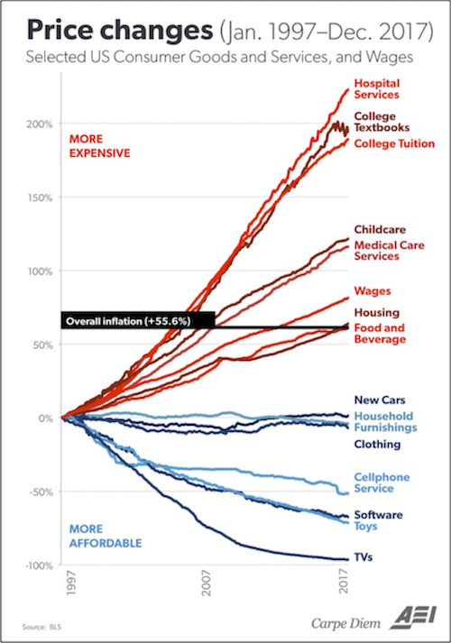
CPI isn’t entirely useless. It can show us broad price trends over long periods. Those trends can reveal some things, as shown in this 20-year American Enterprise Institute chart that’s making the rounds this month.

What jumps out to me is that the highest inflation is in the goods and services over which people have the least discretion. This is particularly burdensome to lower-income Americans. The disinflation that so vexes the Fed impacts more optional purchases. Here’s how my friend Barry Ritholtz describes the pattern:
It is notable that the two big outliers to the upside are health care (hospital, medical care, prescription drugs) and college (tuition, textbooks, etc.).
Clothes, cars, TVs, cell phones, software – technology in general – showed disinflation or outright deflation in prices. (Housing and food & beverage have been right at the middle of inflation levels.)
Wages have barely ticked over the median inflation measure, but that did not stop some people from blaming the correction on rising wages.
Reading the pundits, I cannot tell which fate awaits us: the robot-driven apocalypse where we are all out of work, or the inevitable spike in wages that sends rates much higher and kills the market. Perhaps both – higher wages sends employers into the waiting arms of our automated future.
You can quibble with this data. Have TV prices really fallen 99%? No, unless you hedonically adjust, because today we can buy TVs of a quality that didn’t exist in 1997. If you use hedonic prices, adjusting for quality and technological sophistication, then you can argue that the price of TVs is down 99%. But we all know that we are paying less for TVs. Same for other technology goods. But you simply cannot argue that we are paying the same now for new vehicles as we did 20 years ago, even though the cars we buy today are technologically vastly superior to what we could buy back then. These hedonic price adjustments are guesswork.
Still, the broader point seems right. Inflation is a real problem for some people and no big deal for others, yet the Fed uses inflation measures to impose a single monetary policy on everyone. Is it any wonder that policy doesn’t work for many of us?
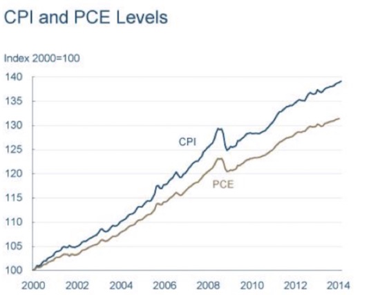
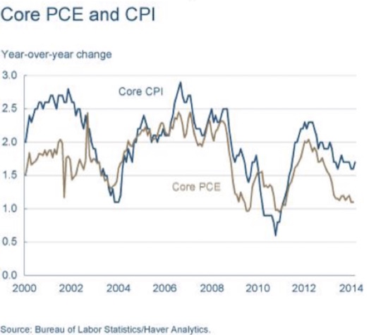
The Federal Reserve prefers to use core PCE rather than core CPI. The Cleveland Fed has a very good basic explanation of the differences between the two indexes. A glance at their charts, below, will show that core PCE (Personal Consumption Expenditures) is significantly lower than core CPI (Consumer Price Index). After the charts, I will quote a few paragraphs from the Cleveland Fed.


What accounts for the difference between the two measures? Both indexes calculate the price level by pricing a basket of goods. If the price of the basket goes up, the price index goes up. But the baskets aren’t the same, and it turns out that the biggest differences between the CPI and PCE arise from the differences in their baskets.
The first difference is sometimes called the weight effect. In calculating an index number, which is a sort of average, some prices get a heavier weight than others. People spend more on some items than others, so they are a larger part of the basket and thus get more weight in the index. For example, spending is affected more if the price of gasoline rises than if the price of limes goes up. The two indexes have different estimates of the appropriate basket. The CPI is based on a survey of what households are buying; the PCE is based on surveys of what businesses are selling.
Another aspect of the baskets that leads to differences is referred to as coverage or scope. The CPI only covers out-of-pocket expenditures on goods and services purchased. It excludes other expenditures that are not paid for directly, for example, medical care paid for by employer-provided insurance, Medicare, and Medicaid. These are, however, included in the PCE.
Finally, the indexes differ in how they account for changes in the basket. This is referred to as the formula effect, because the indexes themselves are calculated using different formulae. The details can get quite complicated, but the gist of the matter is that the PCE tries to account for substitution between goods when one good gets more expensive. Thus, if the price of bread goes up, people buy less bread; and the PCE uses a new basket of goods that accounts for people buying less bread. The CPI uses the same basket as before (again, roughly – the details get complicated).
Now, in conversations with my friend and fellow wonk Peter Boockvar, he has pointed out other, more nuanced differences. The inclusion of government-priced medical care, such as Medicare, where the government manipulates what they will pay, significantly reduces the healthcare inflation of the PCE. And as noted above, the PCE assumes that if the price of something – beef, for instance – goes up, consumers will buy less beef and more chicken, which is cheaper.
You can make the argument that the PCE is biased toward returning lower inflation numbers, but that tendency is almost beside the point. The technical differences between the two indexes make for extraordinarily economically dense discussions, and I’m sure the issues are debated heatedly at certain conferences that focus on such things, but both measures are honest attempts to understand what inflation is and how it affects us. Neither index necessarily reflects the inflation that you are personally experiencing, or the inflation of your particular area or region. And similar differences pertain in every country of the world.
But in most countries, inflation affects the bottom 50% more than it does the top 50% by income. Because there are certain necessities of life that must be purchased, and because many of those goods and services (such as housing, and health care) have higher than average inflation, the bottom half suffers a much higher inflation rate than the overall national average.
And yet, a national inflation policy geared to the lower 50% would aggressively skew monetary policy in a negative fashion.
Sidebar: PCE and CPI use different measures and percentages for housing costs. CPI uses something called Owner’s Equivalent Rent, which is a hypothetical number based on certain assumptions. Here’s a thought project. At one time the US used actual house prices to measure inflation, as Europe does today. If we had been using actual house prices during the period 2000 to 2008, the Fed would have been raising rates aggressively, trying to lean into the inflation caused by the increase in house prices, thereby likely avoiding the housing bubble but creating a recession earlier than 2008, for entirely different reasons.
Tell me again why 12 people sitting around a table should set interest rates based on data they don’t understand, in a market that is way too complex? More loans are based on LIBOR than anything else. And we trust a rather complicated market process, which can somewhat be manipulated, to set the price of LIBOR. Manipulating interest rates in the broader market would be far more difficult and would lead to interest rates that are more reflective of what is going on in the marketplace. Just saying…
Like what you're reading?
Get this free newsletter in your inbox every Saturday! Read our privacy policy here.
In theory, we want “price stability,” which would mean the absence of either inflation or deflation. When Greenspan was asked, when he was chairman of the Fed, what is meant by price stability, he answered “Zero.” None of this 2% inflation target. “Price stability” is the obsession of central bankers everywhere, and in some places is their legal mandate. They currently like having just a little inflation but not too much. The Fed wants 2% and can’t even deliver that, if you define inflation by CPI or PCE. People think that 2% coming. Maybe so.
However, maybe we should all think about this issue differently. Last week I ran across a December 2017 Project Syndicate article by good friend William White, formerly Bank of International Settlements chief economist and now with the OECD. Bill is my favorite central banker in the world. (The full article is well worth reading.)
White says central banks rightly responded to 1970s inflation by clamping down hard, but then failed to adjust when conditions changed. That oversight led directly to some of today’s problems.
From the late 1980s onward, low inflation was largely due to positive supply-side shocks – such as the Baby Boomer-fueled expansion of the labor force and the integration of many emerging countries into the global trading system. These forces boosted growth while lowering inflation. And monetary policy, far from restricting demand, was generally focused on preventing below-target inflation.
As we now know, that led to a period of easy monetary conditions, which, together with financial deregulation and technological developments, sowed the seeds of the 2007 financial crisis and the ensuing recession. The fundamental analytical error then – as it still is today – was a failure to distinguish between alternative sources of disinflation.
The end of the Great Moderation should have disabused policymakers of their belief that low inflation guarantees future economic stability. If anything, the opposite has been true. Having doubled down on their inflation targets, central banks have had to rely on an unprecedented array of untested policy instruments to achieve their goals.
The fixation on keeping inflation low, according to White, has driven up global debt ratios, squeezed lender margins, and forced lending activity into an opaque shadow banking sector. All these effects raise systemic risks that will probably bite us eventually.
Here’s Bill again, with a thought-provoking point I’ve formatted in bold.
These developments constitute a threat not just to financial stability, but also to the workings of the real economy. Moreover, one could argue that easy money itself has contributed to the unexpectedly strong disinflationary forces seen in recent years. Owing to easy financing and regulatory forbearance, aggregate supply has risen as “zombie” companies have proliferated. Meanwhile, aggregate demand has been restrained by the debt headwinds – yet another result of easy monetary conditions.
This insight isn’t intuitive to many economists. Easy credit – as the Fed gave us for the last decade – should raise inflation, not reduce it. Bill says no; it allows zombie companies to survive and overproduce, while putting consumers in so much debt that their spending gets constrained. So it pushes inflation down instead of up.
Wrap your head around that thought. It answers some riddles that otherwise make little sense. But it also highlights the difficulty of formulating sane policy. Yes, it’s important to let zombie companies die. Creative destruction and all that. But real people work for the zombies, earning real money that lets them buy goods and services and keep the economy moving. So what do you do? None of the choices are painless.
Too often, we simply redistribute the pain to those least able to bear it, who are understandably unhappy – hence the present social and political tensions. They all trace back to economics.
Is data boring? Yes. It’s often wrong and misleading, too. But ignoring it to fly by the seat of our pants isn’t the right response, either. We need much better understanding and application of all these numbers, and I see very few economists trying to deliver either. That’s the core problem.
I am getting close to going on too long here, so the prescription for what we should be doing will come in future letters. Suffice it to say that using data that is fundamentally flawed as a “guide” to monetary policy creates the rather strange outcomes that we see. I get extraordinarily angry when central banks and big government proponents argue that it is capitalism and free markets, rather than manipulation and inappropriate regulation, that are the problem. The monetary policymakers never see themselves as the problem. This blind spot is just a corollary to one of my favorite Paul Simon quotes: “A man hears what he wants to hear and disregards the rest.”
This last week was rather exhausting, with late planes and long flights. But I am now back in Dallas and think I will take a little time to relax before plunging into the week on Monday morning. With the exception of speeches and business all day Tuesday, my focus will be on the final plans and my topics for the Strategic Investment Conference in San Diego March 6–9. The conference will be well attended, and as usual almost half of the attendees have been to more than a few SIC conferences, so I will be among old friends. I will spend much of the week talking with the speakers and getting a sense of what they will say, so that I can make sure that I have everything and every topic in its proper order. I must say, what I have heard so far has shown me a surprise here and there, as it seems many are expecting changes and adapting their own businesses and outlooks. If nothing else, it promises to be a week of revelation.
I know my editors are working to pare back my letter, as we are trying to keep it shorter, so I’m going to help them this week by limiting my personal comments to wishing you a great week and hoping that you will find time to be with friends and family.
Your ready for a little rest analyst,

John Mauldin
P.S. If you like my letters, you'll love reading Over My Shoulder with serious economic analysis from my global network, at a surprisingly affordable price. Click here to learn more.
Put Mauldin Economics to work in your portfolio. Your financial journey is unique, and so are your needs. That's why we suggest the following options to suit your preferences:
-
John’s curated thoughts: John Mauldin and editor Patrick Watson share the best research notes and reports of the week, along with a summary of key takeaways. In a world awash with information, John and Patrick help you find the most important insights of the week, from our network of economists and analysts. Read by over 7,500 members. See the full details here.
-
Income investing: Grow your income portfolio with our dividend investing research service, Yield Shark. Dividend analyst Kelly Green guides readers to income investments with clear suggestions and a portfolio of steady dividend payers. Click here to learn more about Yield Shark.
-
Invest in longevity: Transformative Age delivers proven ways to extend your healthy lifespan, and helps you invest in the world’s most cutting-edge health and biotech companies. See more here.
-
Macro investing: Our flagship investment research service is led by Mauldin Economics partner Ed D’Agostino. His thematic approach to investing gives you a portfolio that will benefit from the economy’s most exciting trends—before they are well known. Go here to learn more about Macro Advantage.
Read important disclosures here.
YOUR USE OF THESE MATERIALS IS SUBJECT TO THE TERMS OF THESE DISCLOSURES.
Tags
Did someone forward this article to you?
Click here to get Thoughts from the Frontline in your inbox every Saturday.

 John Mauldin
