Stock Market Valuations and Hamburgers
-
 John Mauldin
- |
- April 9, 2017
- |
- Comments
- |
- View PDF
Stock Market Valuations and Hamburgers
Valuations and Forward Equity Market Returns
Earnings Estimates
Bull Markets Go Out with a Bang
What Will Trigger the Next Bear Market?
Some Final Thoughts from John
Augusta GA, the Masters, and Tampa Bay
“To refer to a personal taste of mine, I’m going to buy hamburgers the rest of my life. When hamburgers go down in price, we sing the ‘Hallelujah Chorus’ in the Buffett household. When hamburgers go up in price, we weep. For most people, it’s the same with everything in life they will be buying -- – except stocks. When stocks go down and you can get more for your money, people don’t like them anymore.”
– Warren Buffett, Fortune magazine: “The Wit and Wisdom of Warren Buffett”
A few weeks ago I spent two days giving multiple speeches alongside my friend Steve Blumenthal of CMG in a very cold New Jersey on the heels of a rather strong blizzard that had left the countryside white and beautiful. I listened to Steve do deep dives on stock market valuations. He started each of his presentations with Warren Buffett’s hamburger story, quoted above, before jumping into multiple charts. After a while, we began to go back and forth during his presentations, as I had my own insights on market valuations, generally in sync with his.
I asked him if he would be willing to do a joint letter on valuations from time to time (as he puts a great deal of research into the topic), and he agreed. This will be the first of our occasional joint letters (assuming we get a good response), with Steve doing the first draft and then me jumping in with comments and charts from my own sources. I want to thank the Ned Davis Research team for allowing us to use a few of their charts and data. (I should note that Steve will be at my conference, for those attendees who would like to talk with him further on this topic.) So let’s jump right in.
Stock Market Valuations and Hamburgers
Warren Buffett is famous for talking about his pleasure when both stock prices and hamburgers are cheap. He appears joyous when prices are down and cries when prices are up.
So should we sing or weep? Warren Buffett has a brilliant way of making the complicated simple. Let’s think about valuations like we think about the price of hamburgers and see if we are going to get more or less for our money. We’ll share with you our favorite valuation charts and story them in a way that we hope will help you better understand the markets and your portfolios.
When we speak to advisors and investors, we use Warren’s hamburger analogy. Heads nod. Eyes lock in. People get it. If, on the other hand, we talk about price-to-earnings ratios (P/E), price-to-sales ratios, price-to-book ratios, eyes glaze over. People generally don’t get it unless they are financial professionals or sophisticated investors. I’m sure you understand finance language, but a lot of people don’t. So for now, let’s talk hamburgers.
We didn’t have all of this big data or computing power in Steve’s early days with Merrill Lynch in 1984 or when I started in the investment publishing industry in 1982. But we do today. What you’ll see in the data that follows is that hamburgers are richly priced. We’ll define what that means in terms of probable returns over the coming 7, 10, and 12 years and what it means in terms of relative risks.
Valuations and Forward Equity Market Returns
Following are a number of our favorite valuation metrics. Let’s take a look at them and see what the research data tell us about probable forward returns (high-priced or low-priced hamburgers):
Median P/E (Price-to-Earnings Ratio)
Think of the P/E like this. Your business has 10,000 shares outstanding, and your current share price is $10. That means your company is worth $100,000 (10,000 x $10). Now, let’s say your company earned $20,000 over the last 12 months. That works out to $2 in earnings for every share of outstanding stock ($20,000 in earnings divided by 10,000 shares). So if your stock price is $10 and your current earnings per share is $2, then your stock price is trading at a P/E of 5 (or simply $10 divided by $2 equals 5). It is simply a metric to see if your “hamburger” is pricey or cheap.
Note, this P/E calculation is based on your previous year’s earnings, not your estimated next year’s, or forward, earnings. If you expect to make $25,000 next year, then your forward P/E ratio is 4. As we will see later, optimistic earning projections can make valuations appear much better than they are. It’s like the old warning: “Objects in the mirror may be closer or larger than they appear.”
With the P/E calculation as a basic starting point, we can see if your hamburgers are expensive or inexpensive. We can look at the S&P 500 Index (a benchmark of “the market”) and we can measure what the average P/E has been over the last 52 years – call that “fair value” or a fair price for a hamburger.
What we see is that a P/E of 5 is a really cheap hamburger. Now, I believe in you, and I believe you can grow your company’s earnings over the coming years; but, wow, if I can buy your great company at a low price, odds are I’m going to make a lot of money on my investment in you. And if I really think you’re going to grow your earnings by 25%, that could make you a bargain.
We can look at the market as if it were a single company and gauge how expensive stocks are now. Over the last 52.8 years, the median fair value for the S&P 500 is a P/E of 17 (we define what we mean by median below). That means a fair price for your company would be the $2 in earnings we already calculated, times 17, or $34 per share. If I can buy your stock for $10 per share instead of its fair value of $34, good for me.
Investors who use this approach are called value investors. I should note that, relative to the actual performance of the market, value investors have been severely underperforming for the past four or five years. They have been punished by seeing assets leave their funds and go to passively managed funds that have shown much better performance at much lower fees. (Note from John: In a few weeks I’m going to talk about the source of this underperformance and what you can do about it. This is a very serious investment conundrum.)
But what if you earn $2 per share and your stock is trading today at $48 per share, or 24 times your earnings? Well then, I’m buying a very expensive burger. So price relative to what your company earns is a good way for us to see if we should sing or weep.
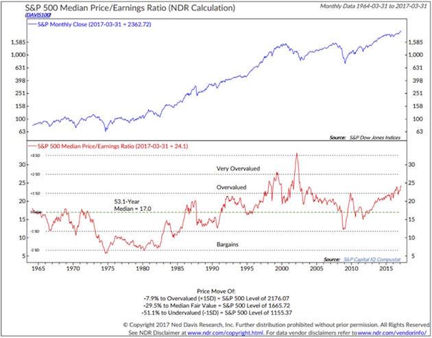
Here is how you read the following chart (from Ned Davis Research):
• Median P/E is the P/E in the middle, meaning there are 250 companies out of 500 that have a higher P/E and 250 that have a lower P/E. Using the median number eliminates the effect that a few very richly valued companies have on the average P/E, which is what you normally see reported in the media and presentations.
• The red line in the lower section shows you how P/Es have moved over time.
• The green dotted line is the 52.8 year median P/E. So a P/E of 17 is the historical “fair value.” Simply a point of reference.
• You can see that over time the red line moves above and below the dotted green line.
• If you remove the 2000–2002 period (the “great bull market”), we currently sit at the second most overvalued point since 1964. (Note: 1966 marked a secular bull market high, to be followed by a bear market that lasted from 1966 to 1982.)
• In the lower section of the chart you also see the labels “Very Overvalued,” “Overvalued,” and “Bargains.”
Like what you're reading?
Get this free newsletter in your inbox every Saturday! Read our privacy policy here.
One last comment on the chart. At the very bottom of the chart, Ned Davis states that the market is now 7.9% above the level at which it is considered to be overvalued.
• That means the market would need to decline from the March 31 S&P 500 Index level of 2362.72 to 2176.07 to get back down to the “overvalued” threshold.
• It would need to decline to 1665.72 to be get to “fair value” (the median). That’s a drop of 29.5%.
• Also note “undervalued,” which we could see in a recession (now -51.1% away).
So fair value for your company is $34 per share (that’s your $2 per share in earnings times the “fair” P/E of 17). I’m thrilled if your stock is selling for $10, because my forward returns will likely be outstanding. Let’s see what that looks like next.
Median P/E and Forward 10-Year Returns
Median P/E can help us predict what future 10-year annualized returns are likely to be for the S&P 500 Index. Will your future burgers be pricey or cheap? The price at which you initially buy matters.
Here is how you read the following chart. (Data is from 1926 through 2014.):
• Median P/E is broken down into quintiles. Ned Davis Research looked at every month-end median P/E and ranked the numbers, with the lowest 20% going into quintile 1, the next 20% into quintile 2, and so on, with the most expensive or highest P/Es going into quintile 5.
• They then looked at forward 10-year returns by taking each month-end P/E and calculating the subsequent 10-year annualized S&P return.
• They sorted those returns into quintiles and determined that returns were greatest when initial P/Es where low and worse when P/Es were high.
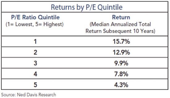
With a current median P/E for the S&P of 24, we find ourselves firmly in quintile 5.That tells us to expect low returns over the coming 10 years. Though it appears that most investors are expecting 10% from equities, history tells us that the market as a whole will have a hard time growing much faster than our country’s GDP does.
Note that 4.3% returns are the average of what happens when stocks are purchased in the top 20% of valuations. That forward return number goes down considerably if we are in the top 10% or top 5%, which is where we are today. The following chart, from Ed Easterling, shows what 20-year returns look like based on starting P/E ratios. Using average P/E ratios rather than the median, we are looking at an average annual return over 20 years of less than 3% from where we are today. Again, not what investors are expecting.
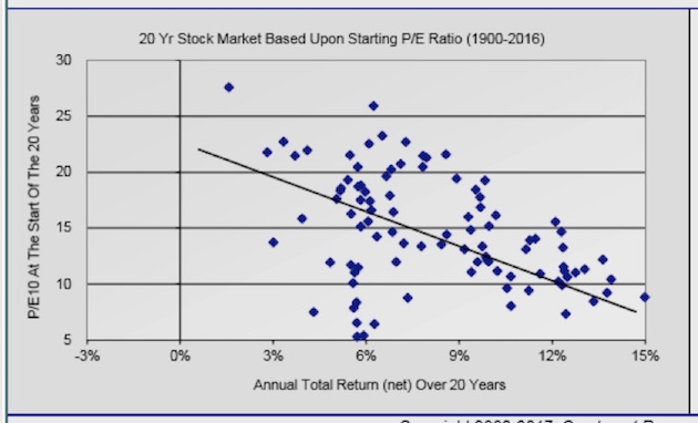
I should point out that, in research done with Ed Easterling and shared in previous letters, we turned up 20-year periods when investors actually lost money (inflation-adjusted). So, the next time you go in for a tune-up of your financial-planning program, have them adjust your forward returns based on some of the data presented above and below. And then be prepared to exercise restraint when they show you the results. And then be determined to work longer and save more, because that’s what you may have to do.
The reality today is that hamburgers are expensive. You’ll need to be mentally prepared to play offense when P/Es eventually shift back down into quintiles 3, 2, and 1; but for now it’s time to play defense and think differently about your portfolio.
Use this next chart as a guide to help you determine which P/E quintile we’re in, going forward. We are clearly in the most expensive valuation quintile now:

Next, let’s next look at some other valuation measurements used by people who know what they’re talking about.
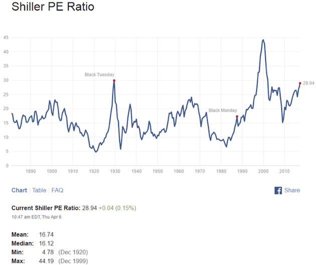
Shiller’s CAPE (cyclically adjusted P/E) – a measurement process that smoothes P/E over the last 10 years
The current Shiller’s CAPE P/E is 28.94, higher than at the market high in 2007, and higher than the bull market peak in 1966. Only 1929 and 2000 were higher.
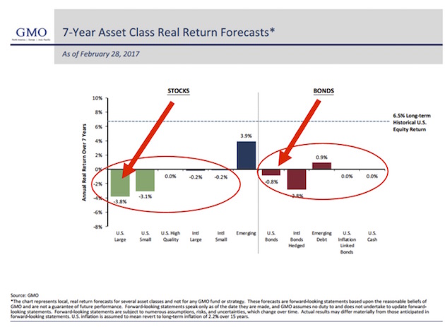
Jeremy Grantham: GMO’s 7-Year Asset Class Real Return Forecast
Here’s how to read the chart:
• Each month for many years, GMO has published its forward return forecasts. There has been a high correlation over time between what GMO predicted and what turned out to be. An approximate 0.97 correlation, actually. That’s as close to the middle of the fairway as any forecaster has hit the ball, as far as I know, which is why you really need to take this forecast seriously.
• In 1999, GMO predicted a -1.9% annual real return over the following seven years for large-cap stocks. “Real” means after inflation. Everyone was racing into tech stocks back then – I’m sure you remember. The actual returns turned out even worse than GMO had forecast. I should note that in 1999 GMO, led by the venerable and brilliant Jeremy Grantham, was seeing a lot of money take flight from its management programs because investors had concluded that Jeremy just didn’t get it. Those investors, many of whom went into conventional momentum-based strategies, then had their heads handed to them, messily, in the next two years. GMO’s assets rose spectacularly during and after the subsequent bear market. We are seeing the pattern repeat today. GMO is once again bleeding assets because investors still don’t think that Grantham gets it. They’ve decided his management style is simply antiquated and his forecasts just can’t be right. Sometimes they really do ring a bell.
• As of February 2017, GMO is forecasting a -3.8% annual return for US large-cap equities and a -0.8% for US bonds over the coming seven years.
• With a richly priced market (expensive hamburgers) and GMO’s strong return forecast history, we find it illogical and unwise to chase into passive buy-and-hold ETFs and index funds at this time. Yet that is what is happening.
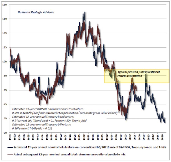
Hussman’s 12-year Return Forecast
John Hussman shared this next chart, and it shows that his 12-year forecast is for 0% to 2% returns before inflation. This is a portfolio based on 60% equities, 30% Treasury bonds, and 10% Treasury bills. Basically, a typical 60/40 portfolio. Question: Do you really think there will be 0% inflation over the next 12 years?
What about Drawdowns?
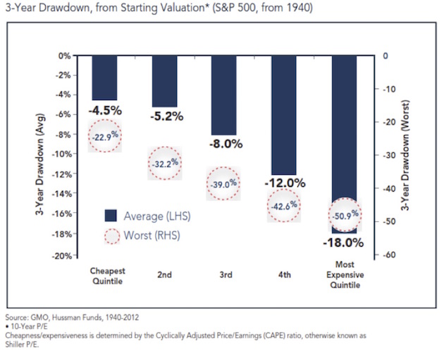
The following chart is a look at the downside risk by valuation quintile.
When valuations are highest, not only are returns lowest but risk is highest. This chart shows that from where we are today we should expect an 18% drawdown in an average case and a worst-case -51% if there is a recession (more recession probabilities in a moment).
Household Equity Ownership Percentage vs. Subsequent Rolling 10-Year S&P 500 Index Total Returns
This next chart shows that household equity ownership percentage has a high correlation with future annualized returns.
Like what you're reading?
Get this free newsletter in your inbox every Saturday! Read our privacy policy here.
Here’s how you read the chart:
• Think in terms of buying power. If individuals are fully invested in stocks, how much more money do they have available to buy more stocks? More buyers than sellers pushes prices higher. More sellers than buyers pushes prices lower.
• Of course there are other buyers and sellers: institutions, corporations, and foreign investors (and now even government central banks). Just stick with us at this point.
• The blue line tracks the percentage of total household financial assets that are equity investments, including mutual funds and pensions.
• Take a look at the top red arrow. At the market top in March 2000, the high level of equity ownership was forecasting a return of -3% annualized over the coming 10 years.
• The black dotted line plots total return over the subsequent 10 years, on a rolling basis.
• Again, focus in on 2000. The dotted black line shows that total return over the following 10 years turned out to be approximately -1%.
• Look how closely the dotted black line tracks the blue line over time.
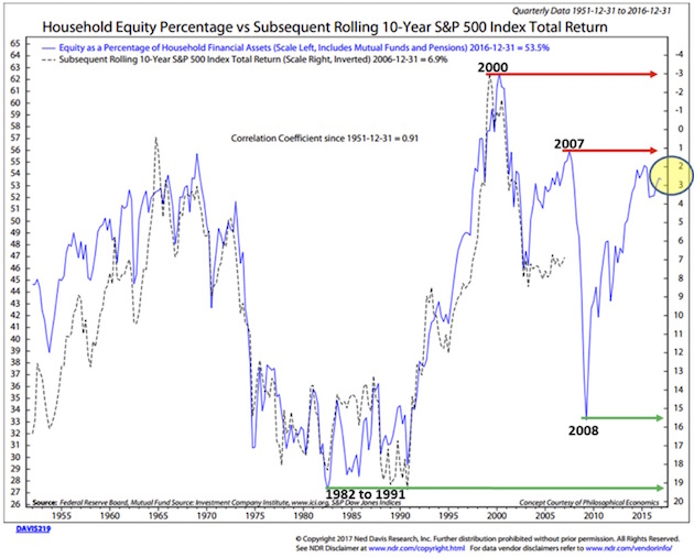
We can use this chart as a guide. We will share it with you from time to time. The point is that we want you to be prepared to overweight stocks when the getting gets good. The hard part is that you’ll need to be a buyer when everyone around you is panicking. That’s when opportunity is always best. But for now, if you are betting that we’re at the beginning of a new bull market, you are really expecting this time to be different.
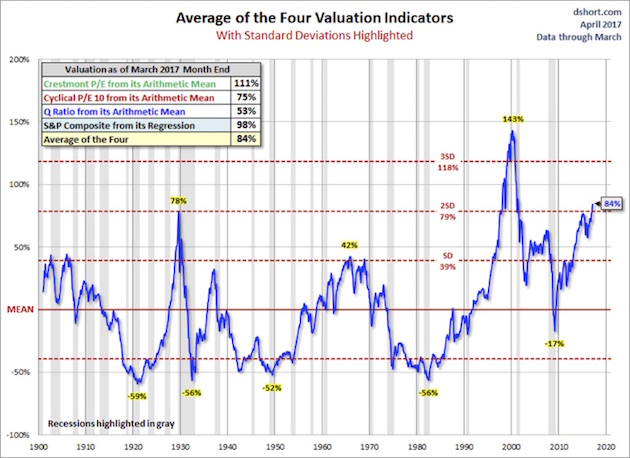
Average of Four Valuation Indicators – Way Above Trend
Here’s how you read this next chart:
• The chart is a simplified summary of valuations obtained by plotting the average of four arithmetic series. It also shows standard deviations above and below the mean.
• Standard deviation measures extreme moves away from normal trend
• The four valuation metrics are the Crestmont PE, the cyclical PE10 (similar to the Shiller PE), the Q ratio, and the S&P composite from its regression.
• Note the far-right number on the chart: 84%. That’s our current valuation, and it’s two standard deviations above trend – the second-most overvalued reading in the data series history.
Valuations – Everything Else: Price-to-Sales, Price-to-Operating Earnings, Etc.
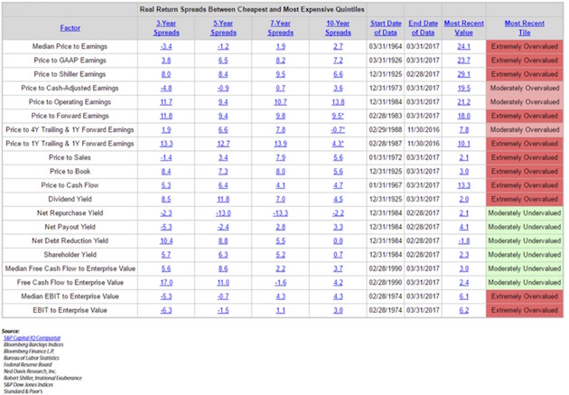
The chart below looks at 20 different ways you can value the stock market. Note that it is possible to come up with valuation metrics that show the market to be moderately undervalued. Most of those methodologies have something to do with yield.
That being said, look to the far right – most valuation metrics are “Extremely Overvalued.”
Median P/E – Selected Dates
(This next section is basically from Steve, triggered by a discussion he had with a reporter from a mainstream media business journal. The journalist was struggling to understand the concept of projecting future returns based on current P/E ratios. Steve gave her the following chart.)
To make this discussion a little more real, I selected several dates to give you an idea as to what the median P/E was then and what the subsequent annualized 10-year return turned out to be.
• Green is low P/E, high subsequent returns
• Red is high P/E, low subsequent returns
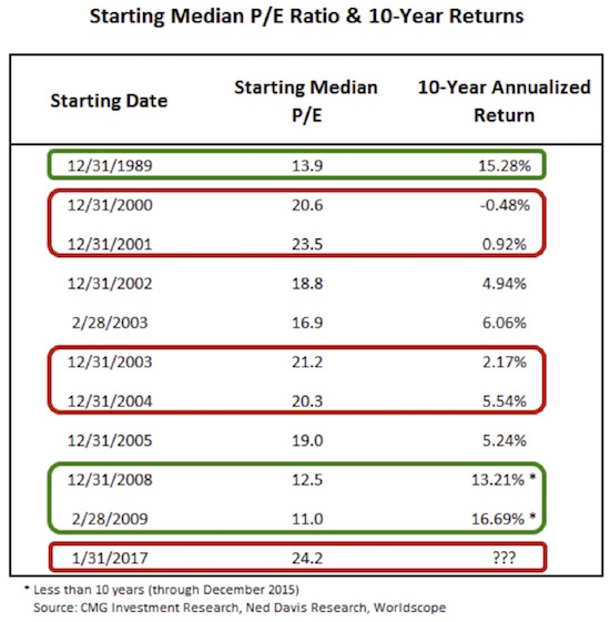
Take a look at the December 2002 median P/E of 18.8. A month prior, on November 11, 2002, Warren Buffett said, “The bubble has popped, but stocks are still not cheap….” He was right. The return over the subsequent 10 years was just 4.94%. Gentle readers, we sit at a median PE of 24.2 today – higher than at any other point in the above chart. Caution!
Earnings Estimates
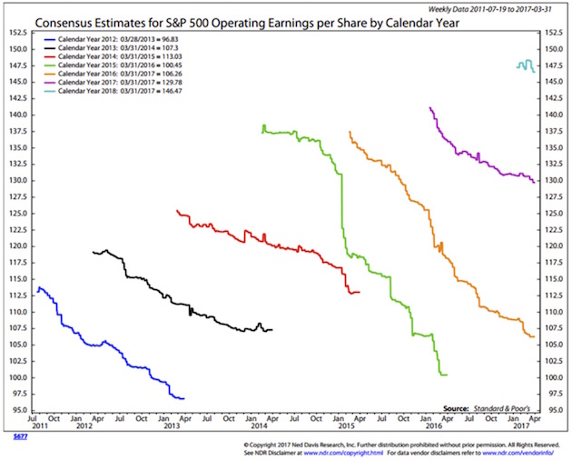
We use median P/E because analysts have historically been too optimistic in their earnings forecasts. This is why we don’t – and don’t believe you should – trust Wall Street estimates.
Here’s how you read the chart:
• The upper end of each squiggly line is the first Wall Street consensus estimate; the bottom of each line is the last.
• Note that for 2016 (the orange line), the first estimate was for $137 earnings per share on the S&P 500 Index, and the last was for $106. That’s a big miss.
• Also note that 2016 may end lower than the actual earnings for 2013 (the black line).
Now, here is another way to look at that same data, from Crestmont Research. What the next chart shows is that the earnings per share for 2016 dropped to $94.55, which is indeed lower than for 2013 and 2014! The initial forecast for 2016, 24 months ago, was for earnings to be $124.20. And as Ed Easterling has noted, the analysts haven’t learned anything: They are starting their predictions for 2018 at well over $130 (upper-right small squiggle). Already, 2017 forecasts are down $10 from the original predictions and are on target to be close to the earnings for 2016!
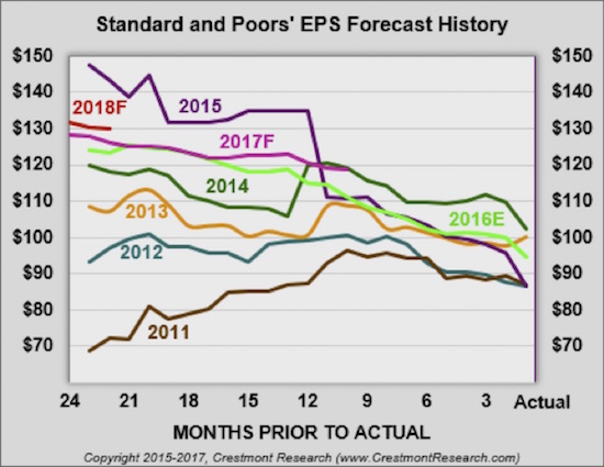
Earnings have been basically flat for the last three years and haven’t really improved all that much in the last six years, and yet we are in a serious cyclical market. The last three years have seen the market rise by over 50% with no earnings increase. As my friend Jared Dillian says, “Dude, it’s a bull market.” Sometimes that simply the only explanation for why the market goes up.
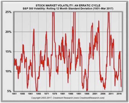
And on top of all that exuberance, volatility has now plunged to 4%, the lowest level in all rolling 12-month periods since 1950. Traders who have been shorting the VIX simply because it’s low and a reversal seems so obvious have been carried out on stretchers for the last three years.
Bull Markets Go Out with a Bang
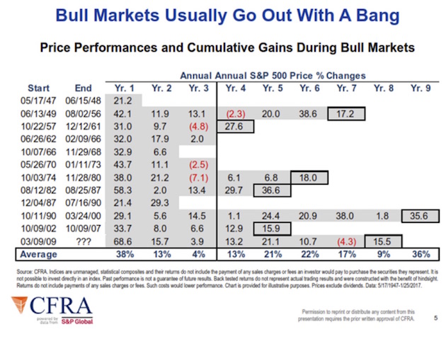
This next chart is almost self-explanatory. Look at the numbers in the boxes outlined in black, which show the final-year performance in every cyclical bull market since 1947. They typically end with a great final blowoff year. Which is precisely what leads investors to pile ever more frenetically into the market, convinced once again that this time is truly different.
What Will Trigger the Next Bear Market?
Every bear market correction since 1947 that didn’t come during a recession was relatively quickly reversed. Think about what happened in 1987 and 1998. There were serious corrections and then a bull market. The bull market that found its footing in 1987 lasted for another 13 years. In 1998, we were only a few years away from a major correction accompanied by a recession. It was in late 1998 and early 1999 that I began writing about a coming secular bear market. Watching the market go even higher throughout 1999 was frustrating, but my book was out, and my words had been immortalized.
Obviously, it’s important to have a sense of when the next recession will happen. But, though the economy is at stall speed and this past week’s employment report proved weaker than expected (though the U-3 unemployment number dropped to 4.5%), there are very few signs that we could actually enter a recession this year.
Like what you're reading?
Get this free newsletter in your inbox every Saturday! Read our privacy policy here.
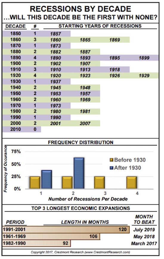
We also have to remember that, as of last month, we are officially in the third-longest period of time since the previous recession. The charts below are again from Ed Easterling’s Crestmont Research, one of the most useful websites I know of.
If there is no recession by 2020, we will have lived through the first decade in 120 years without one. But for that to happen, everything has to go right. We have to have major tax reform – reform that does not include some form of tariffs and/or a border adjustment tax. No tinkering around the edges, no small-ball. We must also have extensive healthcare reform. We have to figure out how to increase the labor force participation rate. And we have to hope that Europe doesn’t blow up, that Italy somehow figures out how to deal with its banking crisis, and that China evades a major credit crisis, etc. – all sorts of things that are out of our control.
We need to put this post-2009 bull market into some historical perspective. These last two charts from Crestmont Research show the beginnings and ends of every bull and bear market since 1920. Every bull market other than the current one began at a point when the market was at a low P/E ratio, and every bear market began when the P/E ratio was high. Since 2000, though, the market has never returned to low valuations. Valuations certainly went down in 2009, but then they turned right around and started back up. This is the strangest “bull market” cycle so far in the last 100 years. Is it possible that it could be different this time? Certainly; anything’s possible. It’s a bull market, dude!
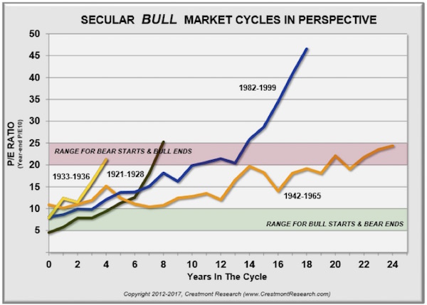
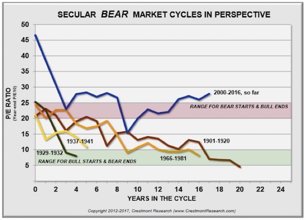
The market never got to “cheap hamburgers” in 2009. Maybe it doesn’t need to, but we need to be aware that valuations are at such a high level that a fall to a P/E level that would get us back into the green zone where most bull markets start would be a bear market of biblical proportions. Think down over 60%.
Some Final Thoughts from John
I’m not saying that we have to get back to the green area now – at some point in the future that will actually happen – but you need to understand that we are at a very interesting, very challenging juncture, and I don’t think traditional buy-and-hold investing styles will be rewarded very well going forward.
In a somewhat cautionary example, I had an associate over at Tectonic Advisors do a search on his Bloomberg for me, analyzing the stocks in the Russell 2000 Index. Just over 30% of those stocks have less than zero earnings – as in, they are losing money. So when somebody passively buys a small-cap index – almost any small-cap index – they are buying a high percentage of companies that have no earnings.
I understand that Amazon and Tesla have no earnings and yet there may be good reasons to buy them. There may be similarly good reasons to buy hundreds of small-cap stocks that have no earnings today, because of expectations of future powerhouse earnings. I am an investor in biotech stocks that have no earnings.
But those are targeted and specific investments, not passive index investments where you get the good and the bad indiscriminately. Yes, active management has had its collective head beaten bloody for the past few years; and the proclivity for passive investing may persist a lot longer than any of us imagine, driving markets higher than many of us believe possible; but I think the stampede into passive investment is going to end up painfully, at the bottom of a cliff, for many investors.
I want to make it clear that I am not suggesting you get out of the stock market. In my own money management program, which is based on diversifying among trading strategies rather than asset classes, the managers I am using all have systems that are telling them to be quite bullish on equities right now.
I am sure that Steve and I could have written a similar letter in early 1999 (if the data had existed) that would have been as cautionary as today’s letter is. And yet, the correct short-term and medium-term position to be in throughout 1999 was long equities. So yes, my call for the beginning of a secular bear market in 1999 was early. It was the correct long-term position, but it was painful to sit on the sidelines. Ditto the experience I had in 2007, when I said we would be having a recession and the markets would go down, which they did – but only after they went up 20% from the date of that call.
I didn’t have to be spanked more than a few times before I learned that trying to talk logic regarding the market – or at least logic as I understand it – is not a useful investment or trading style. Having a rigorous, systematic approach is far better. I’m putting the final touches on a series of white papers on how to invest that we will be releasing to you quite shortly, after the Easter weekend. They are the culmination of years of research and a lot of work on the part of our team of serious investment professionals, and I’m sure you will find them interesting.
Augusta GA, the Masters, and Tampa Bay
I find myself looking out over the Savannah River in Augusta, Georgia. I ended up having to come to Augusta earlier than I had planned due to bad weather and numerous flight cancellations, skipping Atlanta. Augusta is quite the lovely town, and looking out over the river into South Carolina is very relaxing. As you might imagine, my focus this weekend is on the Masters golf tournament, where I am spending the weekend as the guest of good friends. It has been stressed to me that I’m not allowed to bring any digital devices onto the course or into the club, so for the first time in a very long time, other than on very long plane rides over the pond, I will be without connection. Then again, out on that splendid course, one of God’s own very special places, I am sure that my life will be enriched by not having anything in my hands other than a drink and/or a pimento cheese sandwich, which friends tell me is something that you must at least sample.
Monday I head down to Tampa Bay to meet up with Patrick Cox and a few friends to do a deep dive into some of the latest developments in the revolution that is happening in antiaging medicine. And revolution is the precisely correct term. I am utterly amazed at the discoveries being made.
Sometime later next week I’m going to get together with George Friedman for a Skype interview, when we’ll go over some of the presentations and discussion at his Geopolitical Futures conference last week in Washington DC. It was a most thought-provoking event, and I do have a few questions that require further consideration. I will send you a link when that gets done.
And with that, I think I’ll hit the send button and go walk along the river on a beautiful Friday afternoon. Have a great week!
Your unplugging for a few days analyst,

John Mauldin
P.S. If you like my letters, you'll love reading Over My Shoulder with serious economic analysis from my global network, at a surprisingly affordable price. Click here to learn more.
Put Mauldin Economics to work in your portfolio. Your financial journey is unique, and so are your needs. That's why we suggest the following options to suit your preferences:
-
John’s curated thoughts: John Mauldin and editor Patrick Watson share the best research notes and reports of the week, along with a summary of key takeaways. In a world awash with information, John and Patrick help you find the most important insights of the week, from our network of economists and analysts. Read by over 7,500 members. See the full details here.
-
Income investing: Grow your income portfolio with our dividend investing research service, Yield Shark. Dividend analyst Kelly Green guides readers to income investments with clear suggestions and a portfolio of steady dividend payers. Click here to learn more about Yield Shark.
-
Invest in longevity: Transformative Age delivers proven ways to extend your healthy lifespan, and helps you invest in the world’s most cutting-edge health and biotech companies. See more here.
-
Macro investing: Our flagship investment research service is led by Mauldin Economics partner Ed D’Agostino. His thematic approach to investing gives you a portfolio that will benefit from the economy’s most exciting trends—before they are well known. Go here to learn more about Macro Advantage.
Read important disclosures here.
YOUR USE OF THESE MATERIALS IS SUBJECT TO THE TERMS OF THESE DISCLOSURES.
Tags
Did someone forward this article to you?
Click here to get Thoughts from the Frontline in your inbox every Saturday.

 John Mauldin