Springtime Chart Fling
-
 John Mauldin
- |
- March 31, 2018
- |
- Comments
- |
- View PDF
Velocity and Debt
Missing Reflation
Generational Difference
Income Disparity
Deficit Headache
Tech Trouble
Monetary Madness
Charlotte, Fort Lauderdale, Chicago, and Raleigh
Here in Texas you know spring is here when our state flower, the bluebonnet, pops up everywhere. I was at the Masters in Augusta last year, and the azaleas were beautiful. But they are cultivated and take a lot of work to bring out their beauty.
The bluebonnet is pure Texan. It is independent and can thrive anywhere. Anywhere else it would be called a weed. The state of Texas plants 30,000 pounds of bluebonnet seed along our highways every year. Last year was the 100th anniversary of the state’s planting program. And then of course there are the (deep red) Indian paintbrushes and other wildflowers that are planted. Additional oceans of bluebonnets are planted or reseed on private land. Bluebonnets, which need no fertilizer or anything other than sunlight and a little water, are cheap natural nitrogen fixation for hay fields. This time of year you can see the land carpeted here and there with bluebonnets if you fly over Texas.

Photo: Getty Images
We see families taking pictures along the highways, telling their small children to smile and pose. Our family did it, just like everyone else. During bluebonnet season it is impossible to drive around the metroplex on the weekends without seeing people pulled over on the highways taking pictures of the bluebonnet explosions that seemingly erupt overnight.
The bluebonnets make spring a nice time of year – particularly this year, at least for me, because I see little beauty in the economic news.
On the other hand, there is a kind of beauty in seeing the economic indicators graphically, even when I don’t like what they show. So this week I’m going to dip – one last time –into the Strategic Investment Conference slide archives to show you what some of my favorite analysts shared in San Diego. These charts won’t be in any particular order, because they cover several different topics. And because it is Easter and/or Passover weekend, I will keep the word count down.
Just like the weather, the world economy and financial markets go through cycles. Most years, they don’t change suddenly. We get some transition time between the colder and warmer seasons. I fear we may be in an economic transition right now, and it may not be in the direction of the springtime or summer we would prefer. But let’s look at these charts and see what they tell us.
We’ll begin with Lacy Hunt, chief economist at Hoisington Management and all-around monetary genius. He is one of the few who watch the velocity of money, which is continuing to fall, as it has for almost 20 years. This is not the stuff that GDP growth dreams are made of. The last decade saw an average of only 1.9% annual GDP growth. I think we can attribute that underwhelming performance partially to the ongoing fall in the velocity of money.
You may be asking, what exactly is the velocity of money? Essentially, it’s the frequency with which the same dollar changes hands because the holders of the dollar use it to buy something. Higher velocity means more economic activity, which usually means higher growth. So it is somewhat disturbing to see velocity now at its lowest point since 1949, and at levels associated with the Great Depression.
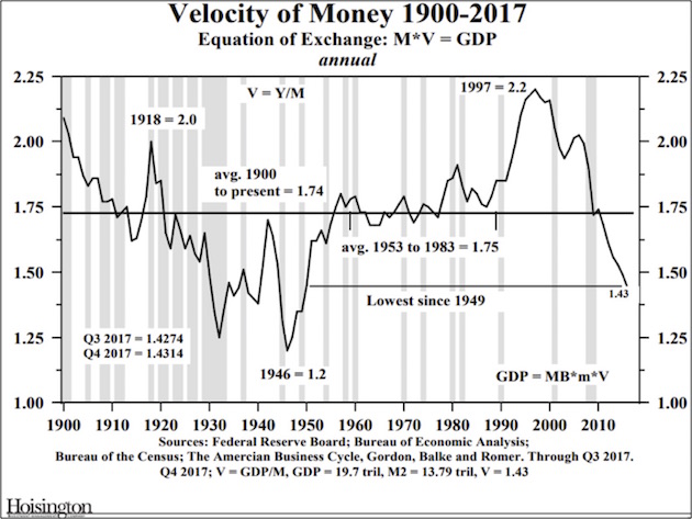
As you see, velocity has been falling for quite a few years now, so by itself this indicator doesn’t signal imminent doom. But the further below average it drops, the more likely problems become. Combine this trend with the late-cycle tax cut and the Fed’s tightening, albeit slowly, and this is an indicator to watch.
Velocity relates to inflation, by the way. If inflation is to accelerate beyond the current relatively benign level, the velocity of money needs pick up. It shows no sign of doing so, which is one reason Lacy sees little inflation risk.
Debt is another big issue for Lacy. People compare debt to addictive drugs, and as with some of those drugs, the dose needed to achieve the desired effect tends to rise over time. The next chart shows the additional economic output (GDP) generated by each additional dollar of business debt in the US.
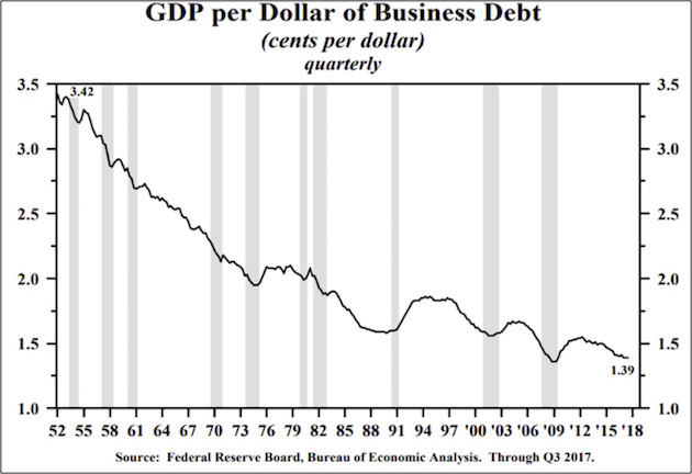
As you can see, debt has become steadily less stimulative over the last several decades. But focus specifically on the lower right area. We saw the debt-growth effect rise, but only for a couple of years as the economy came out of recession. It began sliding again right about the time Ben Bernanke said the Fed would begin “tapering” its QE bond purchases. Now it’s almost back down where it was in the trough of the recession. That’s not encouraging.
Sidebar: The US is not the only country experiencing the dynamic of less growth per dollar borrowed. China in particular has been watching its return on debt drop far more than the US’s has. The Chinese are on a path to almost double their total debt in less than 10 years from 2008, to a level that is far above total US debt and the total debt of much of the rest of the world. There is a reason that Moody’s downgraded China’s debt last year. Just saying…
|
Regime change is here... Are you ready for it? |
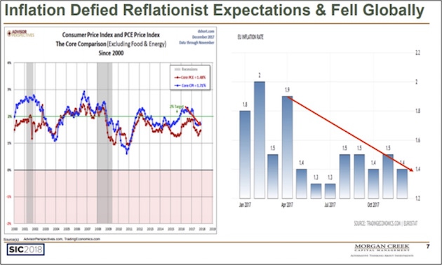
There was a lot of talk about inflation at the conference, and a few commenters openly worried about inflation’s becoming an issue; but in general there wasn’t much real concern about the return of an episode of 70s-style inflation. I am still skeptical that inflation will get to anything more than 2.5% in this cycle unless a trade war sends us spiraling into a deflationary recession. Mark Yusko presented this next chart, which shows that despite so many people’s expecting reflation in the US and Europe, it’s not really happening.
Like what you're reading?
Get this free newsletter in your inbox every Saturday! Read our privacy policy here.
That said, let’s also note that inflation isn’t a one-size-fits-all matter. Much depends on your individual spending patterns. If your largest expenses are healthcare or housing, then your personal inflation rate is probably higher than the national average… for now. This can and probably will change if we get into a recession.
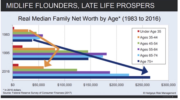
At SIC my good friend Neil Howe and I talked about the differences in generations and especially with regard to income inequality. His data shows that when you were born makes a big difference. Those now 75 and older (what it is generally called the “Silent Generation”) began their economic lives in the 1950s–1960s when businesses were hiring lots of young people and the country was growing. Boomers mostly began their economic lives in the 1980s, just in time for the greatest bull market in history. This generational experience shows up in the distribution of wealth that we have today.

With apologies to Generation X, which followed the Boomers, the age-wealth disparity is even more apparent in the next chart. As older generations have prospered, Gen Xers have actually seen their median net worth go down in the last 20 years. Ugh. Basically, the young rule in terms of numbers, but the old rule in terms of dollars.
At SIC I showed several charts on wage disparity, but I think the following is the one I find most poignant. (It was sent to me by Jonathan Tepper of Variant Perception.) Note that it is the 95th percentile of workers that has received the bulk of the increase in wages. The bottom 50% is either down or basically flat since 1979. Even the 70th percentile didn’t do all that well.
The average wage increase was boosted mostly by the gains that top wage earners made. This income-growth disparity is one of the key reasons for the increased frustration with “elites.” And this same gap is widening across much of Europe and the rest of the world.
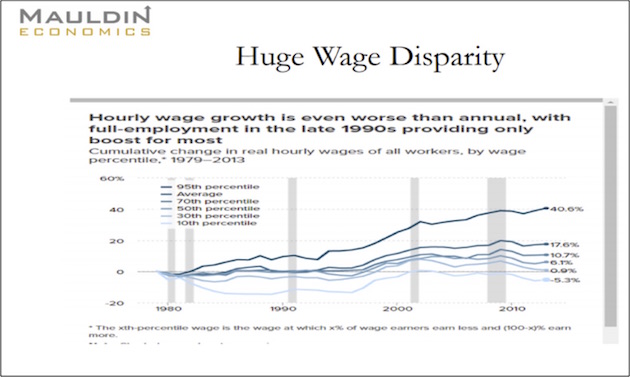
We will talk about this trend more in future letters, but I’m afraid that the differentials in income and wealth are going to increase, not decrease, for a variety of reasons. For one thing, that’s just where we are in the economic cycle, though with technological change and globalization are important factors, too, and not ones that politicians can readily control. Frustration will be on the increase, too.
Louis Gave, one of the Gavekal founders, is a human research machine and always a SIC favorite. This year he talked about differences between the US and China and where the world’s two largest economies are going. He has a fascinating thesis that defies summarizing, so I’ll just show you a couple of his US-focused charts.
First, we have this chart of the 30-year Treasury yield since 2010. Note the very consistent downward trendline. Note also what it did in early 2018.
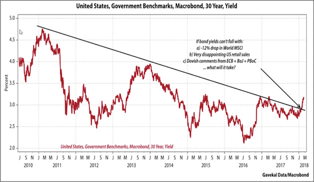
It was no great surprise that long-term bond yields fell steadily as the Federal Reserve gorged itself on purchases of long-term bonds. Nor is it surprising that yields should rise now that the Fed is withdrawing from that market. But other things are happening, too, as Louis notes in the chart. If a US economy that is growing slowly at best, along with continued stimulus from Europe, China, and Japan, isn’t enough to keep US bond yields from rising, what will? And if yields rise a great deal more, recession odds will rise, too. And by definition, recessions are deflationary, and we will see interest rates decline in the developed world when recession comes again. That prospect is startling to contemplate, given how low rates already are.
Our growing government debt is part of the problem. Louis graphed it as a percentage of GDP going back to 1966.
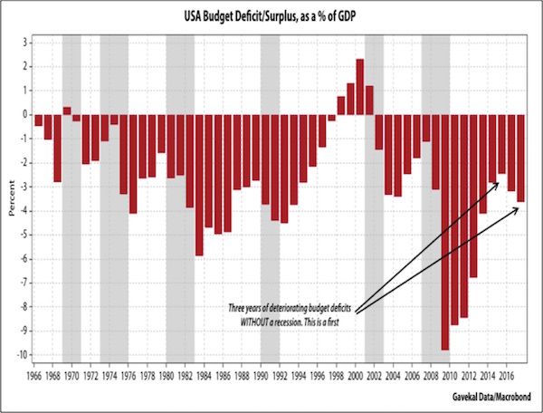
Over the last half-century, higher deficits have been associated with recessions. After recessions end, the deficit shrinks, and occasionally (e.g., after Clinton and Gingrich cut their deal) we get a surplus. That’s not happening this time. Deficits are growing even without a recession.
On the positive side, today’s annual deficits are nowhere near 2009–2012 levels. That’s encouraging, but in the next recession tax revenues will fall, and spending will increase enough to not only swell the annual deficit but also to add north of $2 trillion to the national debt each year. We’re using up our breathing room, and that will be a problem – sooner or later.
Like what you're reading?
Get this free newsletter in your inbox every Saturday! Read our privacy policy here.
This next chart comes from a wide-ranging presentation by Jeffrey Gundlach of DoubleLine Capital. It may be either good news or bad news, and even Gundlach wasn’t sure which.
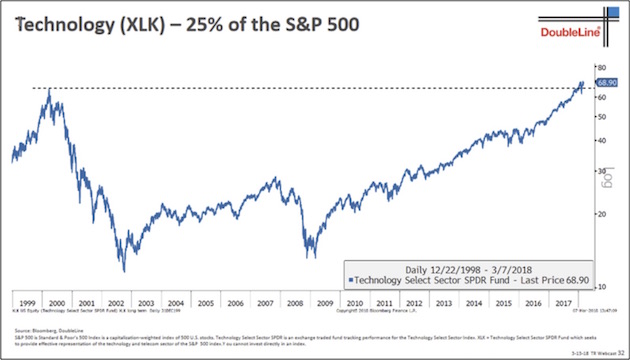
The chart shows the XLK Technology ETF, which consists of the S&P 500 Index technology components. That dotted line shows that XLK only recently surpassed the high it set back in the year-2000 tech boom. If you are a technical analysis fan, this performance might seem bullish – we have a breakout from long-term resistance. But is it really?
For one thing, XLK is not now the same collection of stocks as XLK was then. Apple was a smaller component in 2000, while Facebook and others weren’t even public yet. Dell was a big player in that period but is now private and delisted. So is the comparison really valid? Maybe not. And even if it is, I’m not sure we can call this a convincing breakout yet. And given the last two weeks, it may not become one.
Gundlach also showed a chart for XLF, a financials ETF, and it has a similar pattern. If neither technology nor financials can keep rising from here, this bull market may be in for a long pause and possibly a breakdown. Take heed if you’re exposed to those types of stocks in particular.
Finally, let’s wrap with two charts from Grant Williams. He talked at length about US monetary policy and the way it has evolved over the years. Here’s a chart summarizing it.
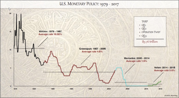
The line colors denote each Fed chair’s tenure, and Grant has calculated their average federal funds rates. Younger readers will probably find those Volcker years incomprehensible. 20% overnight rates? Yes, it happened. I remember having a bank line from which I borrowed at 20%. And was happy to get it. And rates were 10% or close to it for more than five years. Hard to imagine now, even for us graybeards who lived through that time.
In any case, I suspect Jerome Powell will break the pattern of each chair’s delivering lower rates than the last. Yellen’s 0.5% average will be hard to beat – though if we get into a recession, he may well try.
Grant also showed this next one, which adds the 10-year bond yield to the chart above. It looks similar to Louis Gave’s 30-year yield chart but goes back further. Here again we see a nice downtrend that appears to be getting broken.
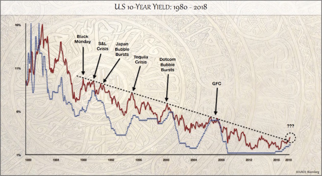
Ominously, you can see from Grant’s labels with arrows that peak yields tended to correspond with crises. If the current breakout persists, it is probably going to get its own label, and I bet we won’t like it.
We’ll conclude our spring chartfest there. If you want your own SIC Virtual Pass that includes the complete slide collections plus audio and video of all the presenters, click here.
Charlotte, Fort Lauderdale, Chicago, and Raleigh
You may have noticed in this week’s Outside the Box that I’m pondering some changes, along with my management team. I am finding myself busier and busier, mostly for good reasons, but my exploding to-do list is forcing me to re-examine priorities. My natural optimism makes me think I can do everything. The reality is, I can’t. I need to focus more energy on researching and writing, not to mention producing revenue, as well as thinking about portfolio construction; but I also want to keep bringing you free letters like this one. Somewhere in there is a happy medium. I’d like your feedback, so please take this short, anonymous survey.
I am home next week, but in April and May I travel to Charlotte, Fort Lauderdale, Chicago, and Raleigh for mostly private speaking engagements. The exception is a seminar open to financial advisors and brokers and sponsored by S&P, happening in Charlotte on April 11. The event is built around the theme of strategic and tactical ETF trading strategies.
The weather is beautiful this weekend in Dallas. The Mavericks are in a home stand, and I get to watch some pro hoops. As a side note, the new tax bill no longer allows companies to buy game tickets, give them away, and deduct the cost. I am wondering how that will impact revenue, especially for all those suites. My ticket partner used them to reward his best salesmen and now may not take his half. I will either find a new ticket partner or two, or I will have to let my tickets go back after 35 years, which is a shame because I have really good seats. But at some point you have to rationalize all those costs. Scalping a ticket or three or four a season would be a whole lot cheaper; but then again, if I find a partner…? We’ll see. Let me wish you a Happy Easter and/or Passover. Have a great week!
Your going to relax for the whole weekend for once analyst,

John Mauldin
P.S. If you like my letters, you'll love reading Over My Shoulder with serious economic analysis from my global network, at a surprisingly affordable price. Click here to learn more.
Put Mauldin Economics to work in your portfolio. Your financial journey is unique, and so are your needs. That's why we suggest the following options to suit your preferences:
-
John’s curated thoughts: John Mauldin and editor Patrick Watson share the best research notes and reports of the week, along with a summary of key takeaways. In a world awash with information, John and Patrick help you find the most important insights of the week, from our network of economists and analysts. Read by over 7,500 members. See the full details here.
-
Income investing: Grow your income portfolio with our dividend investing research service, Yield Shark. Dividend analyst Kelly Green guides readers to income investments with clear suggestions and a portfolio of steady dividend payers. Click here to learn more about Yield Shark.
-
Invest in longevity: Transformative Age delivers proven ways to extend your healthy lifespan, and helps you invest in the world’s most cutting-edge health and biotech companies. See more here.
-
Macro investing: Our flagship investment research service is led by Mauldin Economics partner Ed D’Agostino. His thematic approach to investing gives you a portfolio that will benefit from the economy’s most exciting trends—before they are well known. Go here to learn more about Macro Advantage.
Tags
Did someone forward this article to you?
Click here to get Thoughts from the Frontline in your inbox every Saturday.

 John Mauldin
